Loading journal
Baseline
EP. 04 - Zetafonts
Riccardo Merlotti
5 March 2026
Founded in Florence in 2001 by Cosimo Lorenzo Pancini, Francesco Canovaro, and Debora Manetti, Zetafonts is one of the first independent digital type foundries in Italy, and is still today one of the most active and relevant voices in Italian type design.
Zetafonts’ approach is the most versatile and wide-ranging you can find in a foundry — not only in terms of the variety of its catalogue, but across all of its initiatives: from published books to the TypeCampus project, as well as its recent social collaboration with Caffè Design.
“We believe that our commercial work should be supported by cultural research and educational activities to create a powerful and meaningful community.”
With more than two thousand typefaces designed over 25 years of activity, Zetafonts continues to build a catalogue that ranges from the most classical Clarendon-inspired work (Barnum) to decorative typefaces such as Stadio Now — a revival of Novarese’s celebrated Stadio — and Bogart.
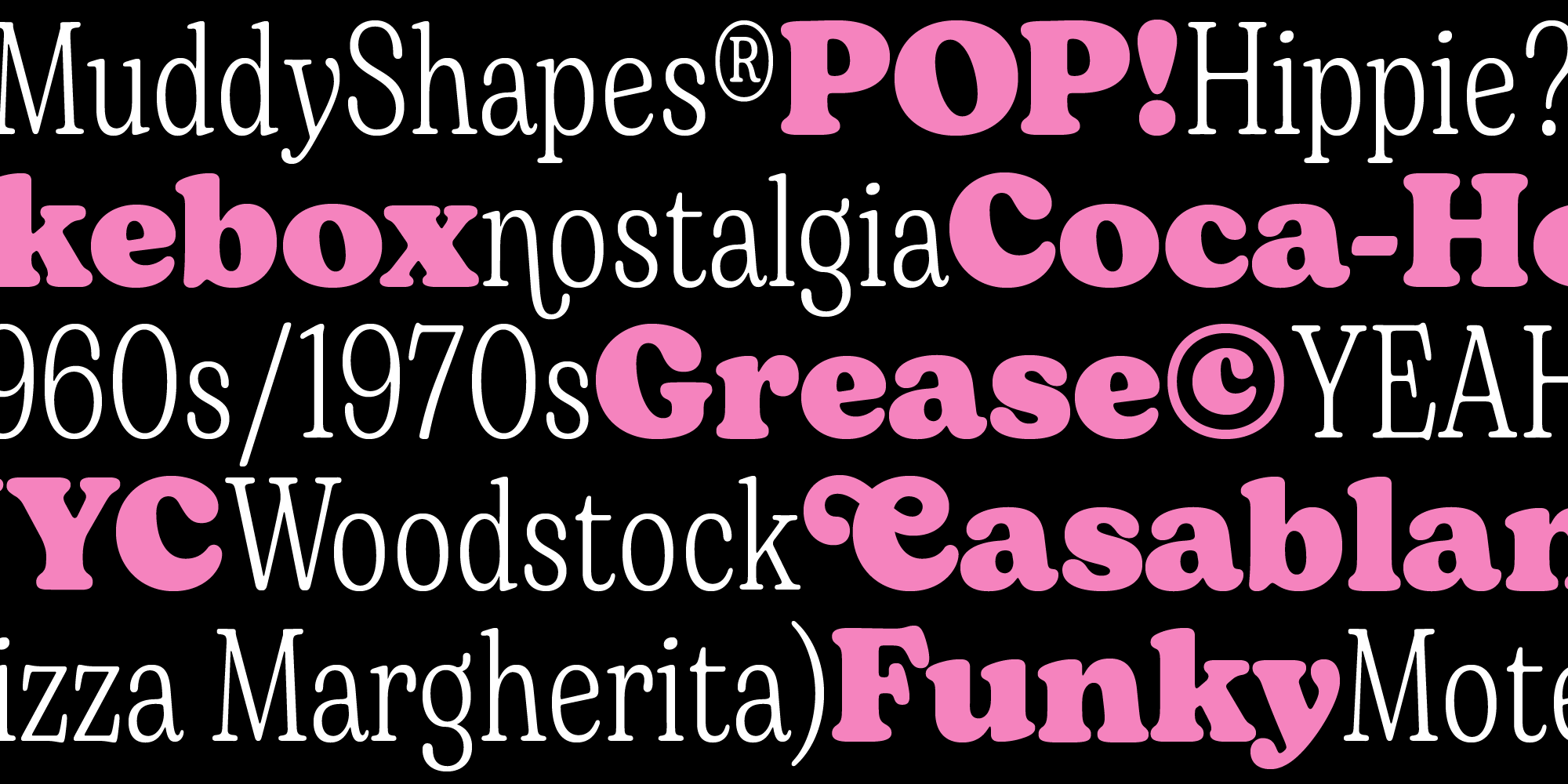
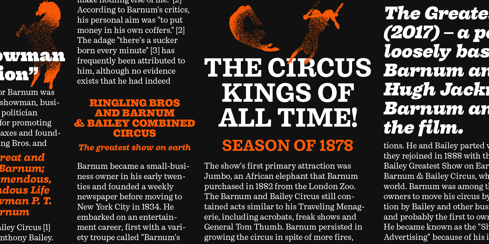
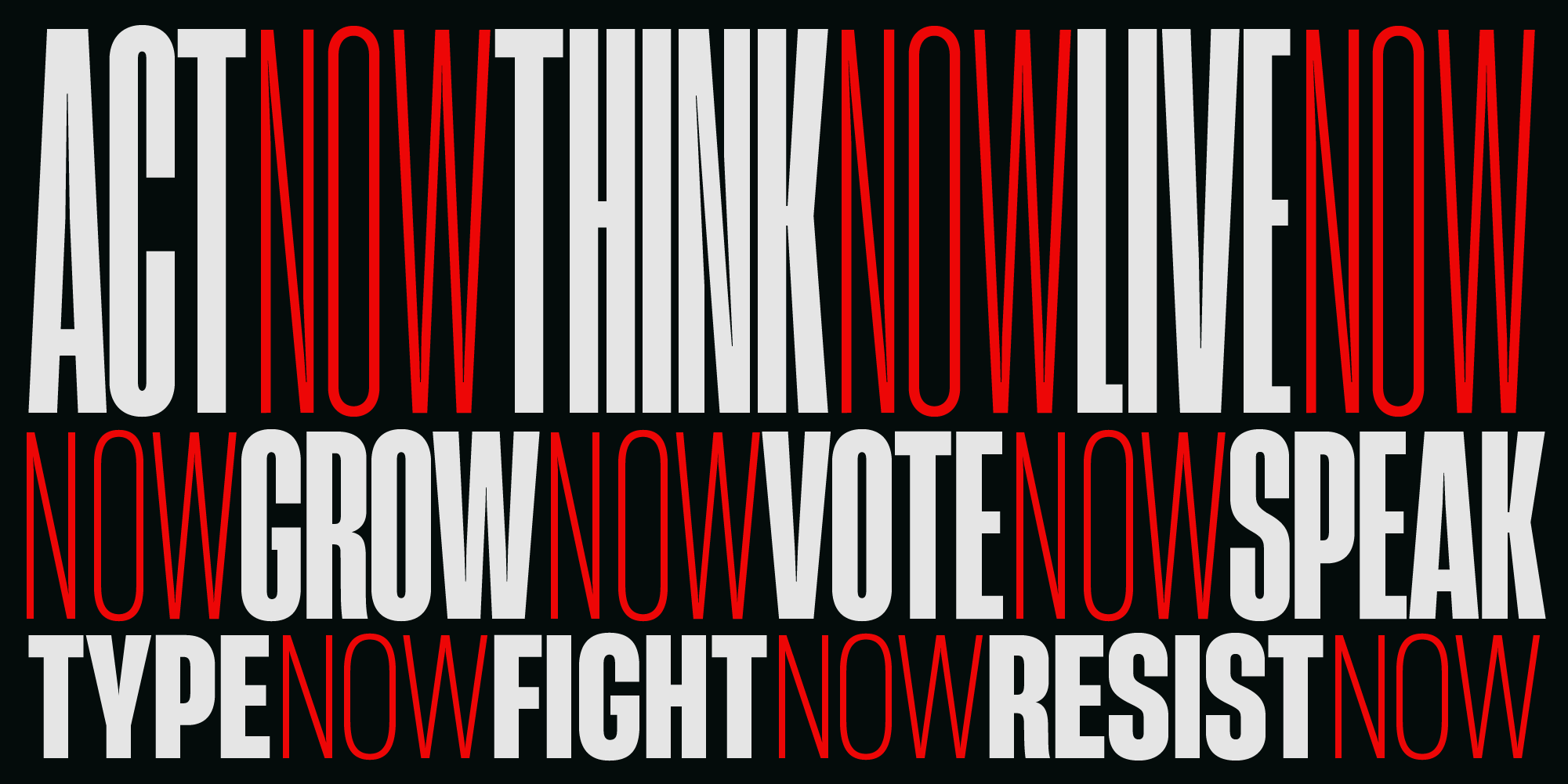
This tendency toward extensiveness applies not only to the range of different styles, but also to the design methodology behind each individual family. Alongside a strong presence of multi-script fonts, it's not uncommon to find superfamilies — font families spanning a very broad design space, encompassing multiple weights and widths — among the foundry's releases such as Eastman, Codec Pro, and Heading Now.
The latter in particular is one of the most iconic and widely used typefaces produced by the Florentine foundry. Heading Now is a family of 176 styles, developed across two axes of variability, revisiting the aesthetic of 20th-century grotesques through a contemporary lens.
But the true focus of this episode is Stadio Now, one of the projects into which Zetafonts has poured the most energy in recent years. The roots of Stadio go back to 1974, when the original typeface was drawn by Aldo Novarese for Reber and distributed as dry-transfer lettering — remaining its only form until the revival designed by Zetafonts.
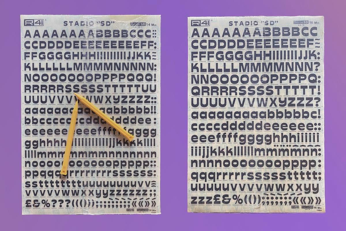
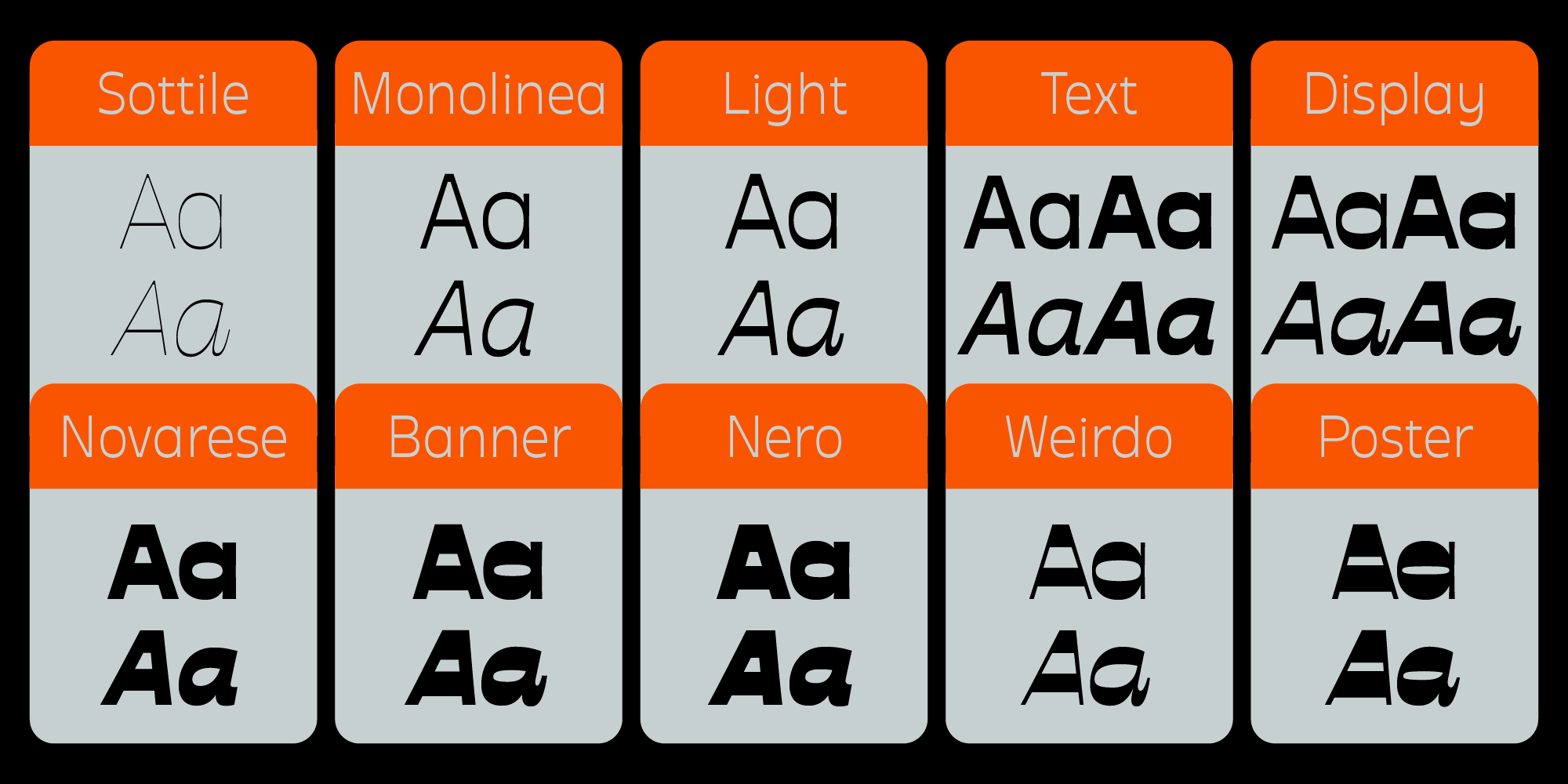
A revival that plays with great respect on Novarese’s distinctive reverse contrast, both by restraining it in the lighter weights and by amplifying its idiosyncrasies in the Banner and Weirdo weights. Also notable is the design of the Italic, which adds serifs that make it even more decorative, while still preserving the same degree of abstraction originally envisioned by Novarese.
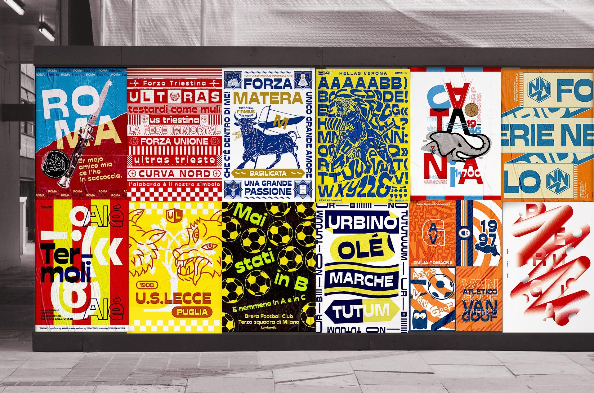
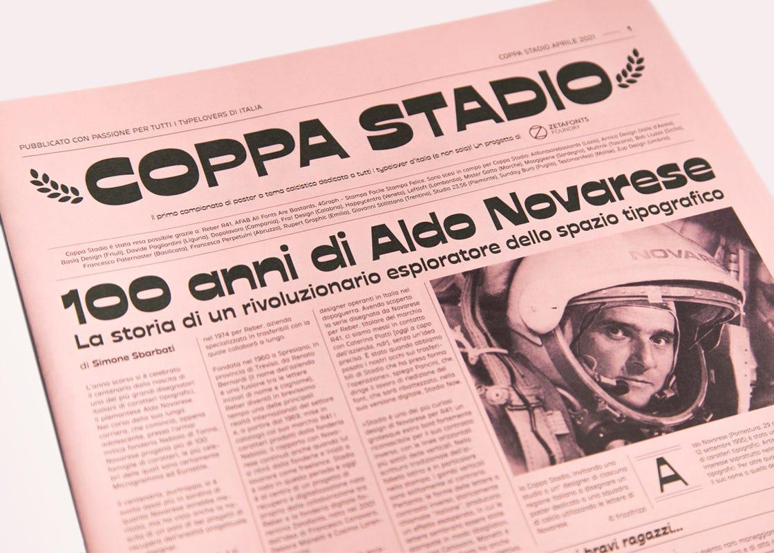
In true Zetafonts fashion, the release of Stadio Now was accompanied by several initiatives to celebrate the typeface: from the Stadio scarf distributed during the pre-release — designed with All Fonts Are Bastard — to the standout event Coppa Stadio.
With Coppa Stadio, the foundry actually created an “Italian tournament for football poster design,” inviting 20 studios — one per region — to design a poster using Novarese’s letterforms and compete on Zetafonts’ Instagram profile.
Everything that surrounds Stadio, as with so many other Zetafonts typefaces, tells us one thing: the passion for their work has never faded, even after more than twenty years since they began.