Loading journal
Baseline
EP. 05 – Formula Type
Riccardo Merlotti
2 April 2026
After years of working in graphic design, Piero Di Biase — also AGI member since 2017 — decided in the beginning of 2022 to fully commit to type design by founding Formula Type.
Type design was nothing new to him, having already pursued it at Think Work Observe — the studio established in 2011 with Alberto Moreu, now Multi Form — as a side activity to graphic design, with a retail catalogue that enjoyed considerable success even back then.
With Formula Type, however, Piero Di Biase is embarking on a new chapter, building a catalogue almost from scratch with a keen focus on quality and detail.
“Formula is a potion blended especially for those who will drink it. Formula is a chemical equation that leads to a result.”
As the foundry’s name suggests, the focus is on the process, on a perfect formula that inevitably leads to a good result: from the initial idea through to mastering, passing through the hands of the type designers who, from time to time, take part in the creation of a foundry typeface.
What distinguishes Formula Type’s approach from that of many foundries in Italy is precisely this cooperative way in which it engages directly with its collaborators. It is not simply a matter of delegating certain technical aspects to other professionals, but of working closely with each of them, making this design chemistry the driving force behind every project.
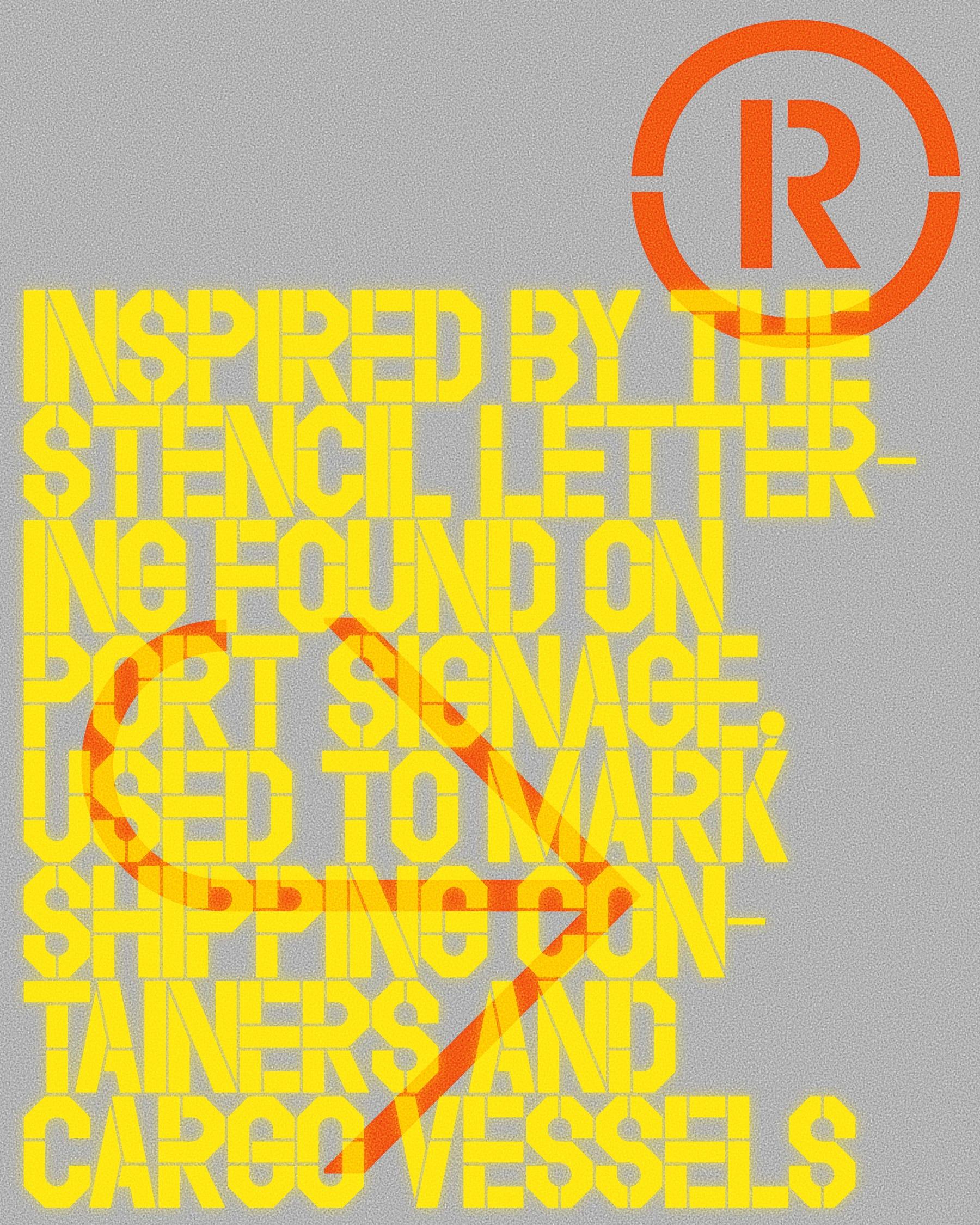
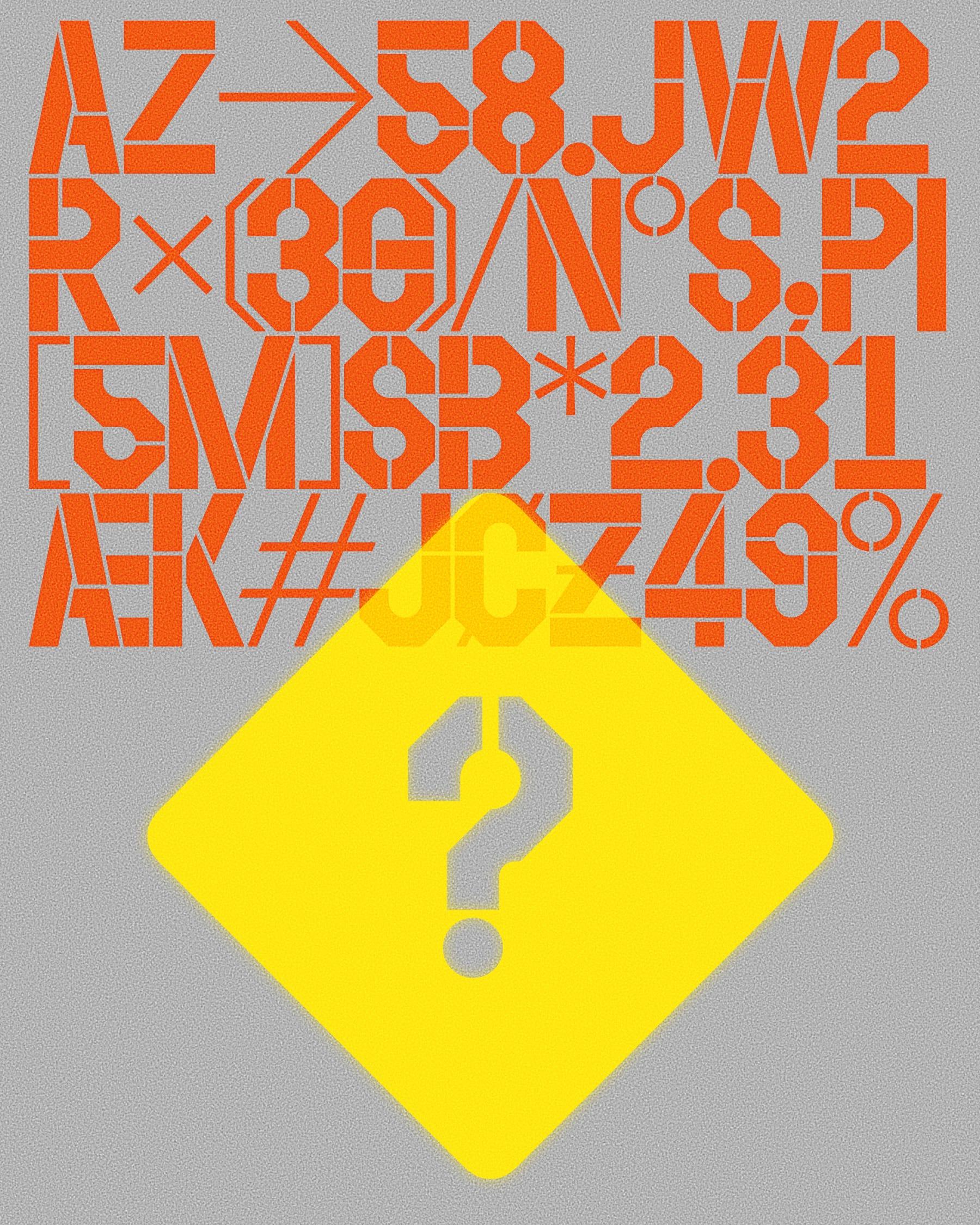
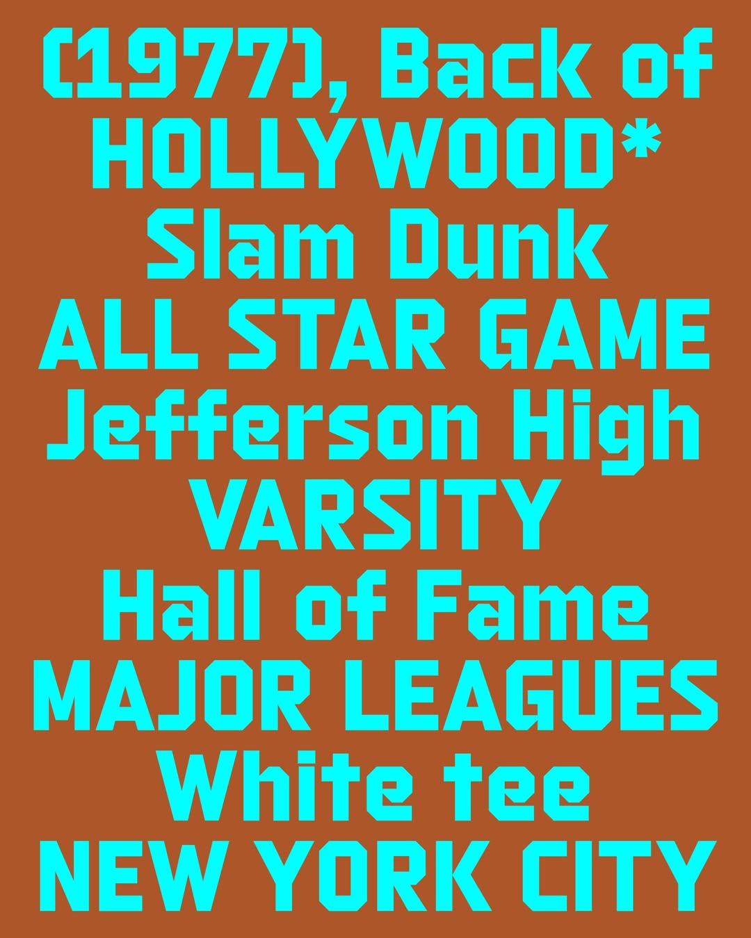
The editorial direction of the catalogue is guided by the idea of meeting the needs of designers, without, however, sacrificing experimentation. This is the case of Athletic, a display typeface inspired by the condensed, angular lettering of US sports teams — whose strokes and connections also recall some of Wim Crouwel’s experiments — or Speaker, a font inspired by flip-disc displays that reinterprets the aesthetics of dot-matrix typefaces with a vast set of glyphs and pictograms.
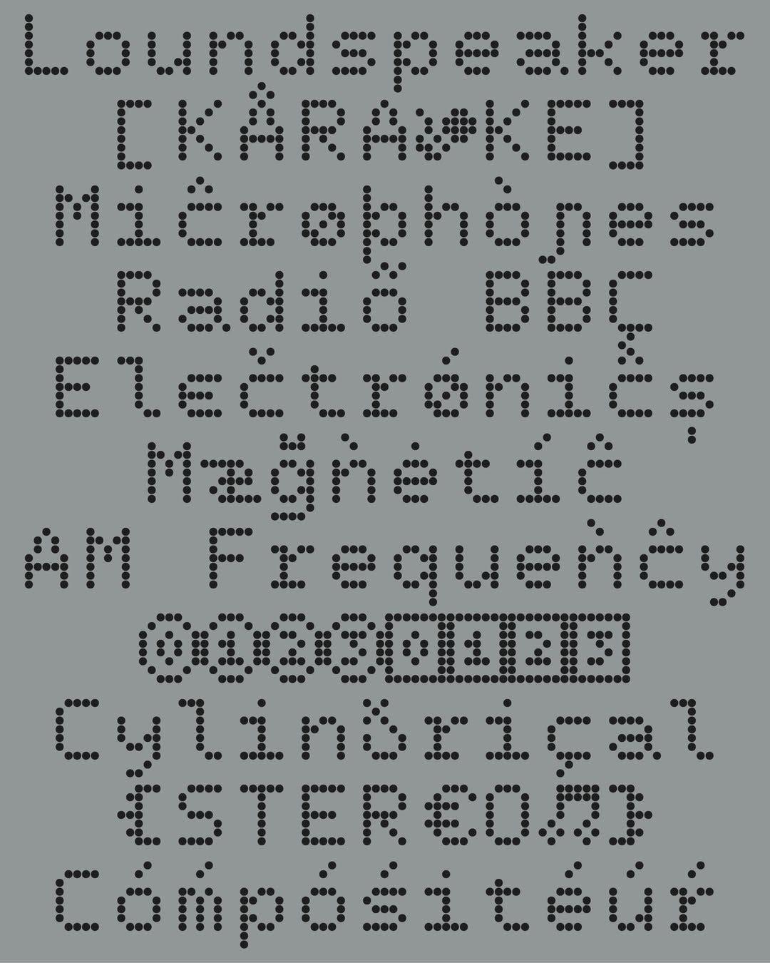
The real stars of the catalogue, though, are the sans serifs: Aktual, Regola Neue and, in particular, Kunst Grotesk: the typeface chosen for this episode’s focus.
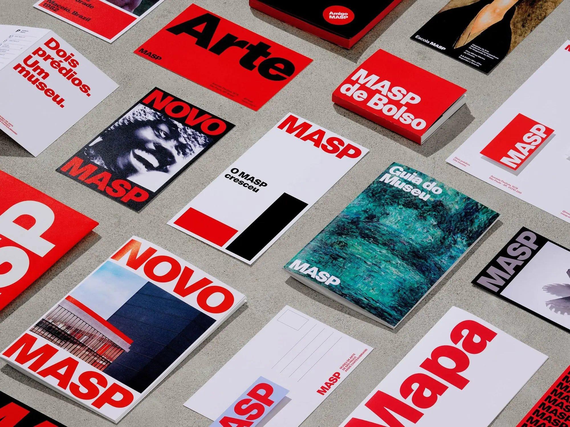
With a comprehensive family consisting of 5 weights (from Light to Black) and their respective Italics, Kunst Grotesk fits into the — in some ways oversaturated — landscape of 1950s sans-serif typefaces, offering a modern interpretation that is particularly legible at any size.
First and foremost, Kunst manages to stand out from the other sans-serif ‘offspring’ of Neue Haas by featuring narrower uppercase letters, sacrificing space in the counterforms of letters such as B, P and R, and thereby prioritising legibility and harmony with the lowercase letters.
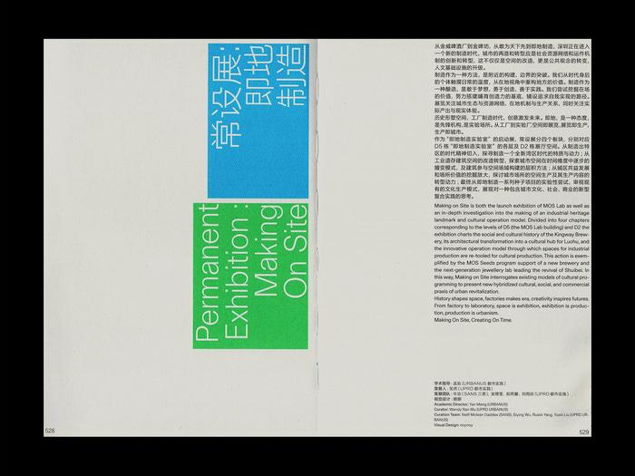
But even more significant is the use of contrast, particularly in the bowls and the finer junctions, which makes Kunst still more interesting in the Bold and Black weights, even when used as a display typeface at larger sizes.
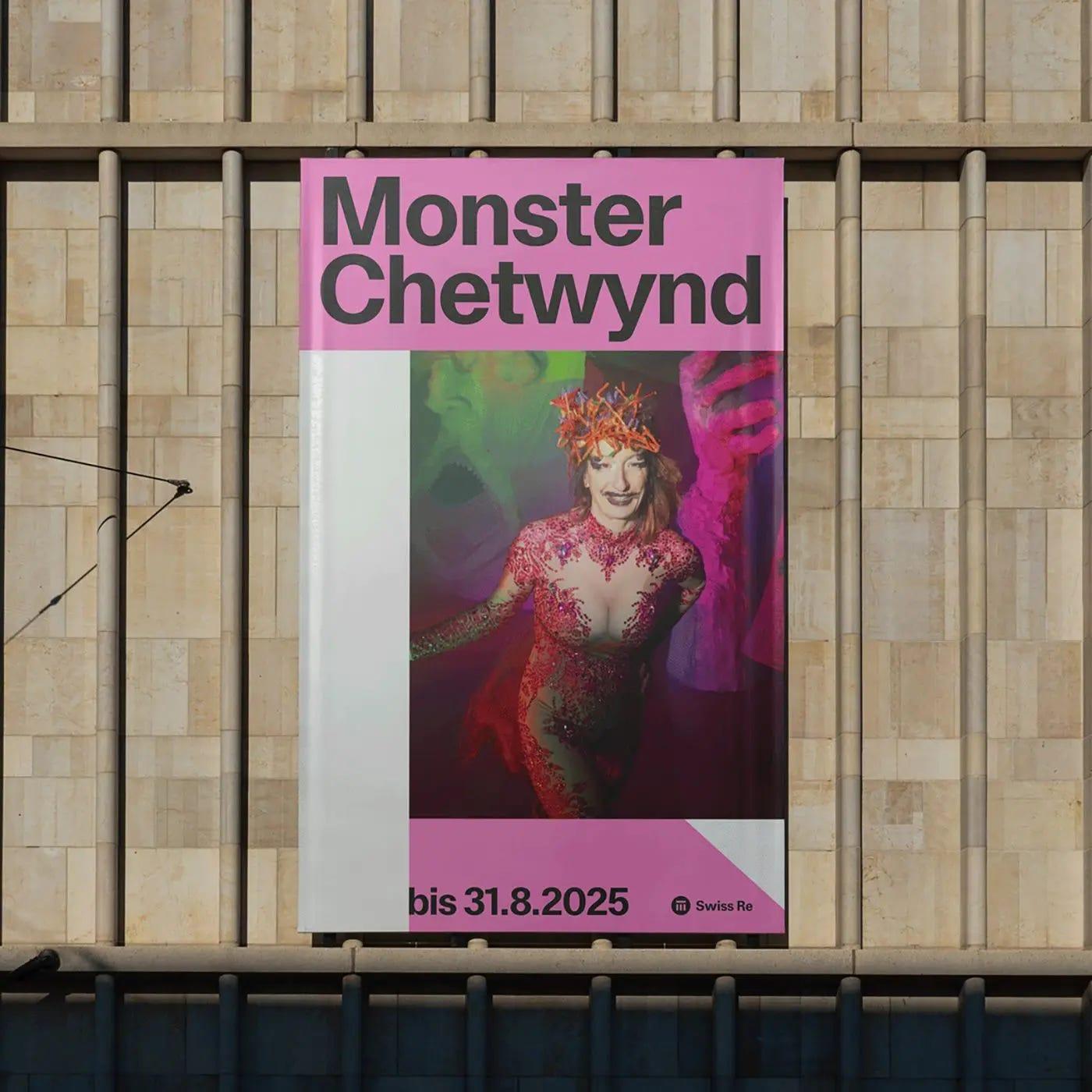
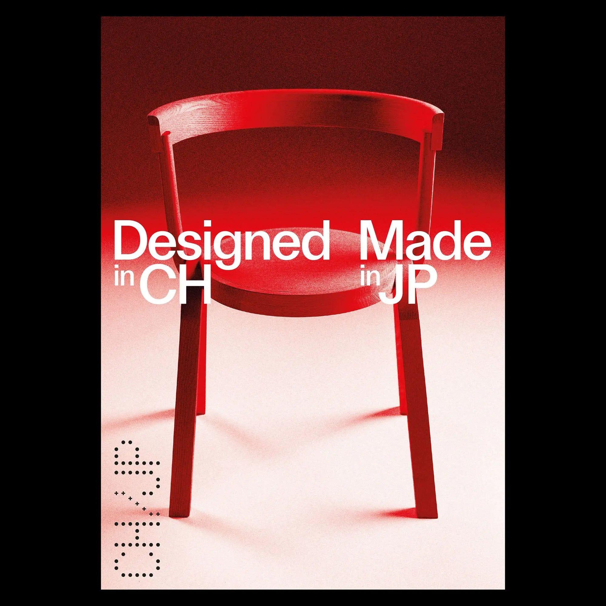
Perhaps this is the clearest expression of Formula Type's approach: a typeface that knows exactly what it wants to be, and feels immediately at home in the hands of the designer who will use it.