Loading journal
Baseline
EP. 06 – CAST
Riccardo Merlotti
7 May 2026
Born out of the need to speak as a collective voice in a far-from-saturated type design landscape, in 2013 CAST (Cooperativa Anonima Servizi Tipografici) was founded as one of the most important independent type foundries in Italy to this day.
From the very beginning, CAST’s strength has been gathering among its members some of the most talented researchers and type designers of their generation in Italy (including Luciano Perondi, Marta Bernstein, Riccardo Olocco and Alessandro Colizzi), and has continued over time to attract designers capable of bringing new perspectives without betraying the cooperative’s identity. All of this happens through a genuinely cooperative process: decisions are made together, without rigid hierarchies, with a united front both in type design and research projects.
“We decide together. Not symbolically—really together. That means more meetings, more persuasion, more time… and a much stronger sense that the work is ours.”
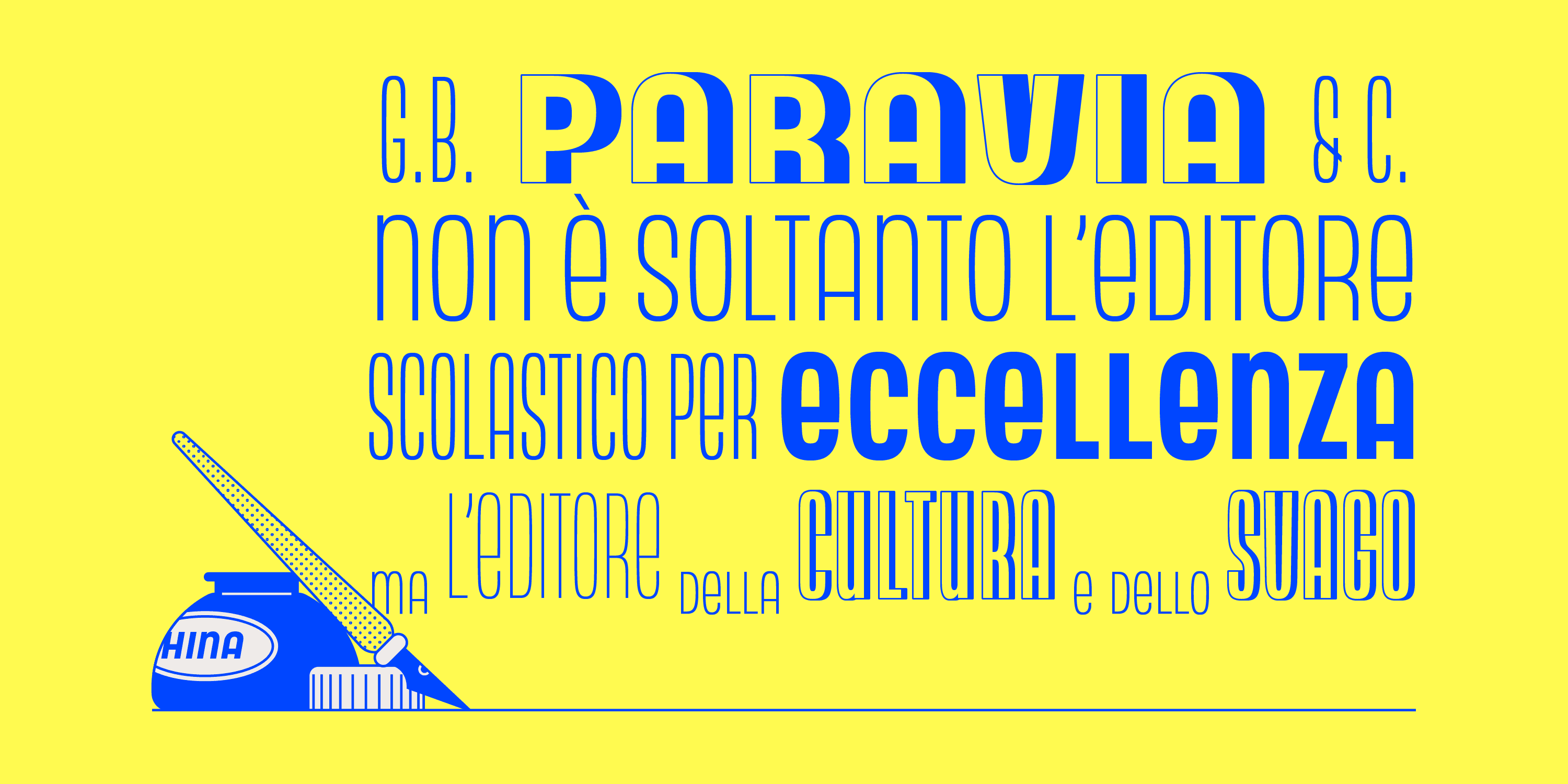
Typographic and historical research is indeed the common thread running through the work of many foundry members, and it often acts as the driving force behind the release of new typefaces. A case in point is Neon NBL — a faithful revival of Giulio Da Milano’s unicase typeface — redesigned by Alessandro Colizzi in 2019 as a complement to the Nebiolo History Project, a historical research initiative carried forward by many CAST members.
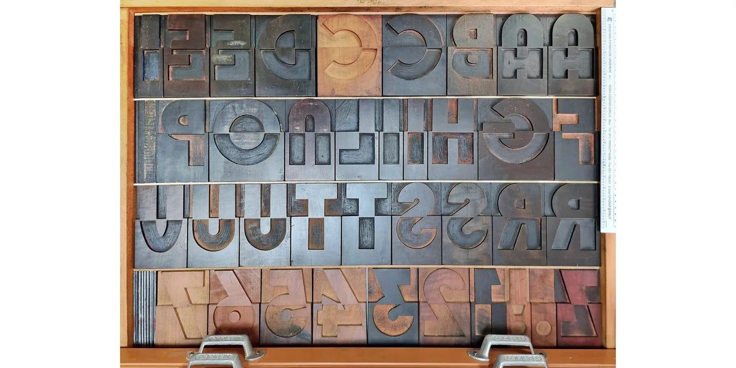
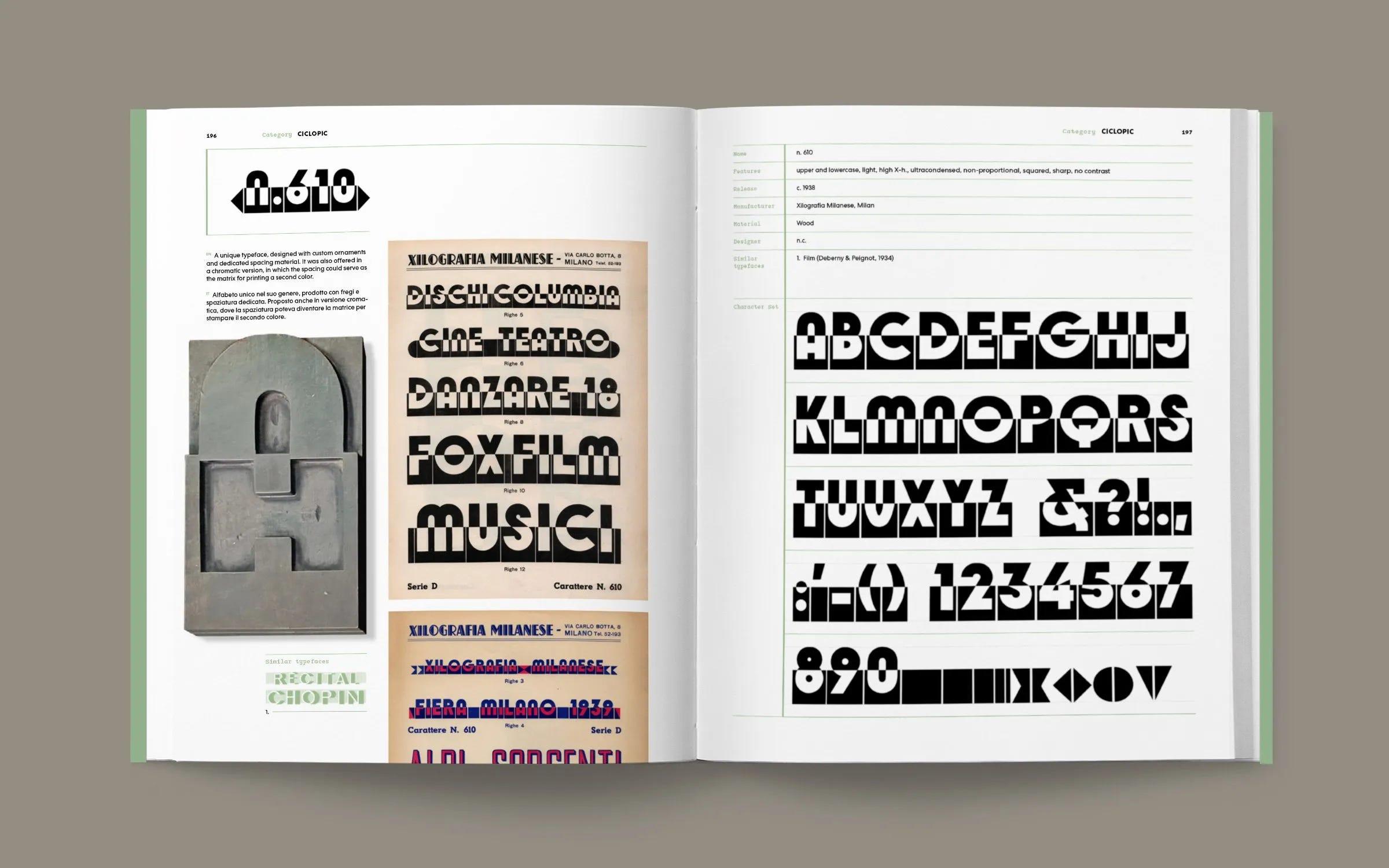
But above all, when speaking of research projects and historical type revivals, one must mention Alfabeti Modernisti: a project started by Luca Lattuga — a movable type archivist and founder of the letterpress studio Anonima Impressori — who brought CAST on board to digitise 25 typefaces originally produced between 1930 and 1945.
Developing these typefaces, recently released online and showed in a printed specimen published by Lazy Dog Press, the foundry involved nearly twenty designers, between foundry members and external collaborators. The result is a choral work that restores dignity to often-forgotten modernist-era wood types, giving them a new digital life.
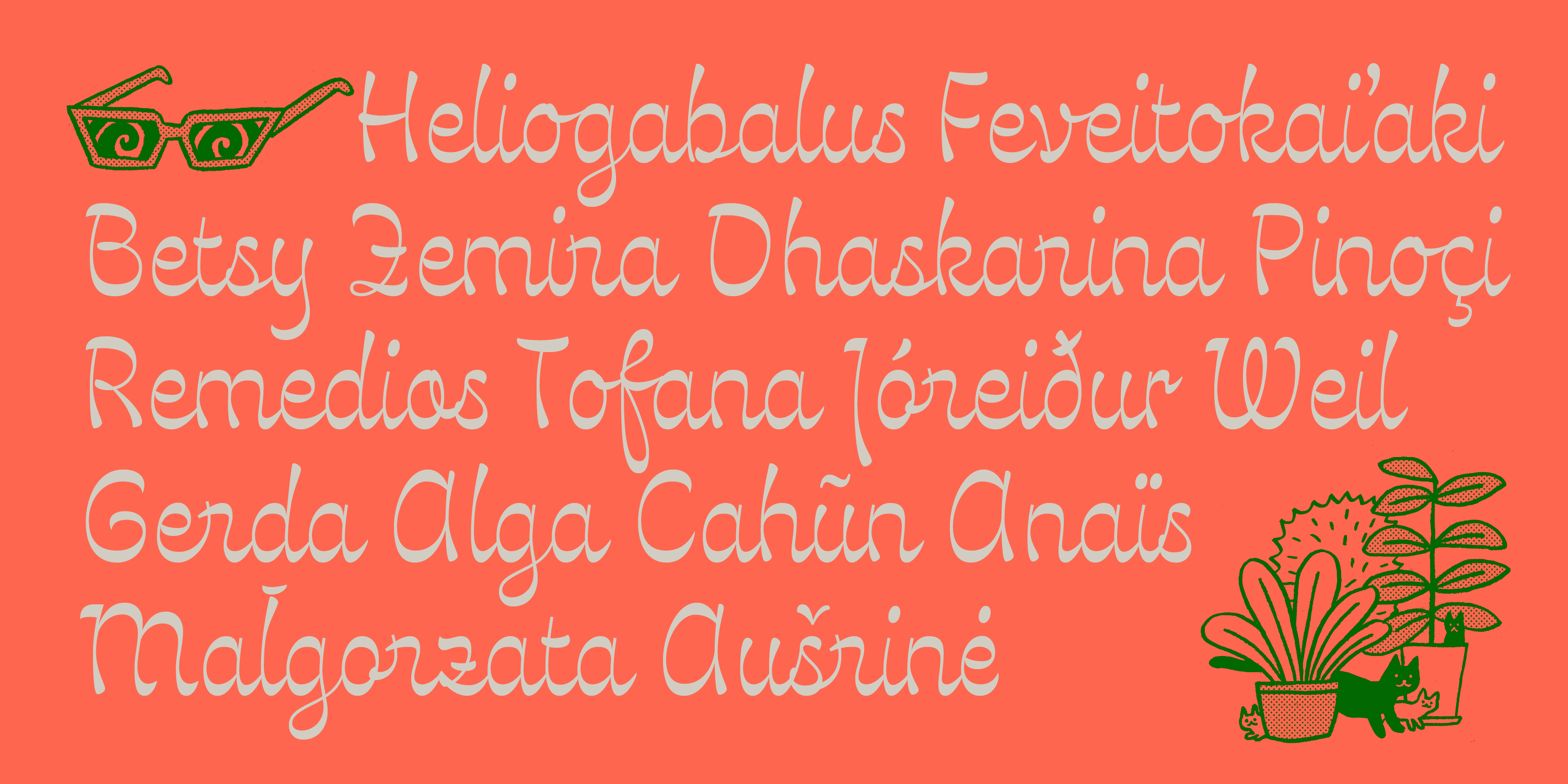
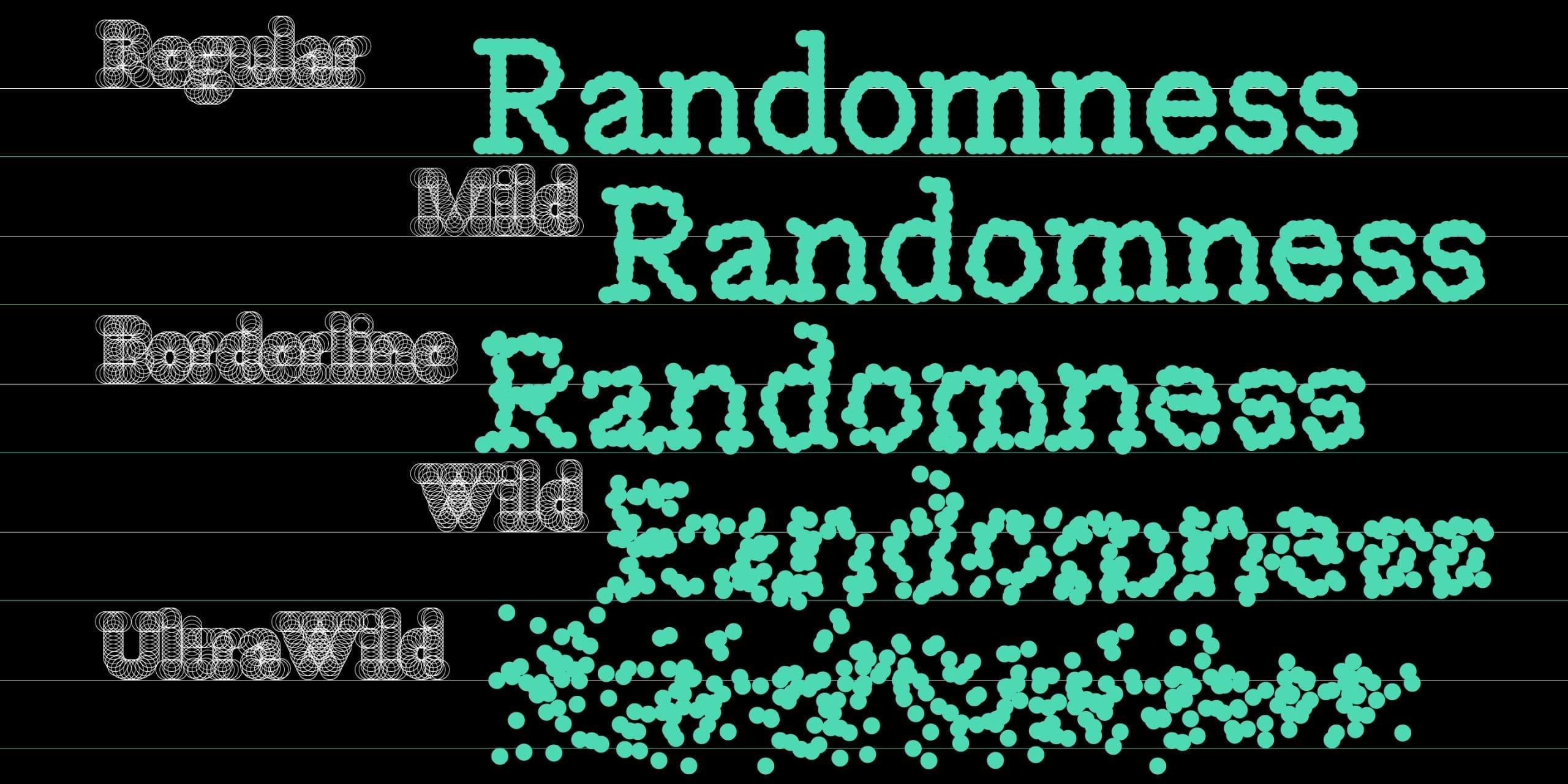
CAST’s extensive catalogue also features unique experiments — such as Valentina Casali’s use of OpenType ligatures in Estrojeune and Pritzious; alongside the variable axes in Giulio Galli’s Scatterplot — as well as large original families like Scotus Sans and the more widely known Sole Serif and Sole Sans, designed for the Italian daily Il Sole 24 Ore with a strong focus on legibility for printed matter.
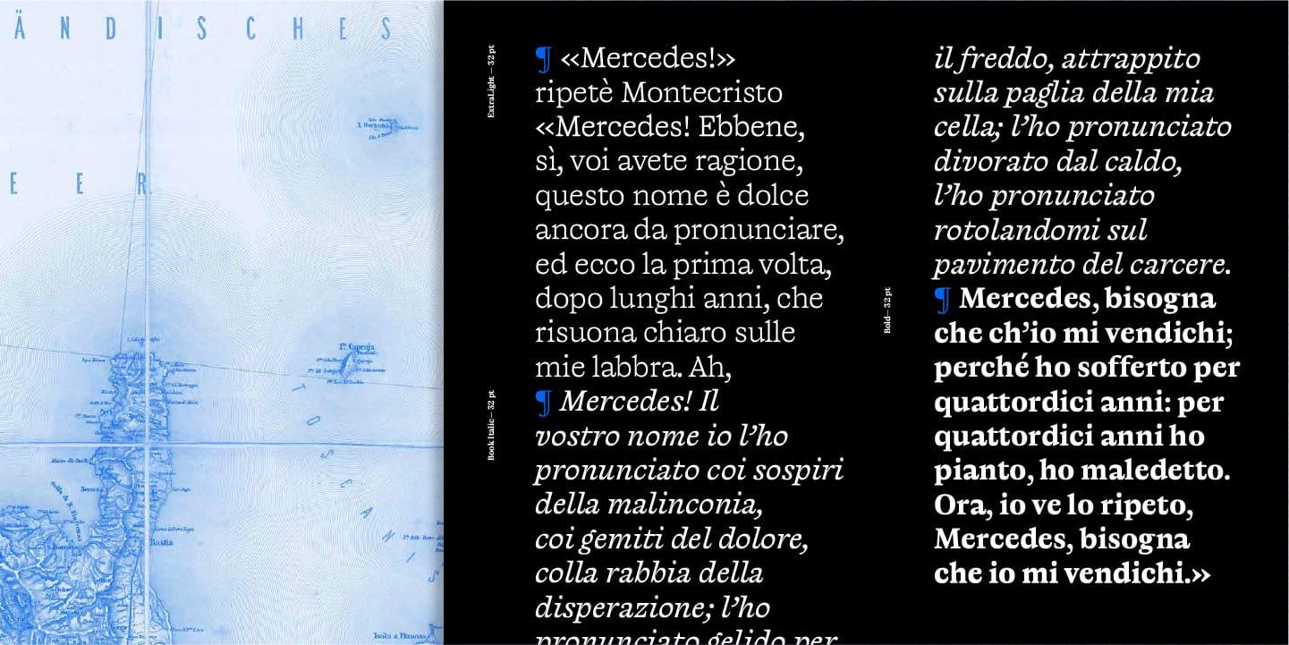
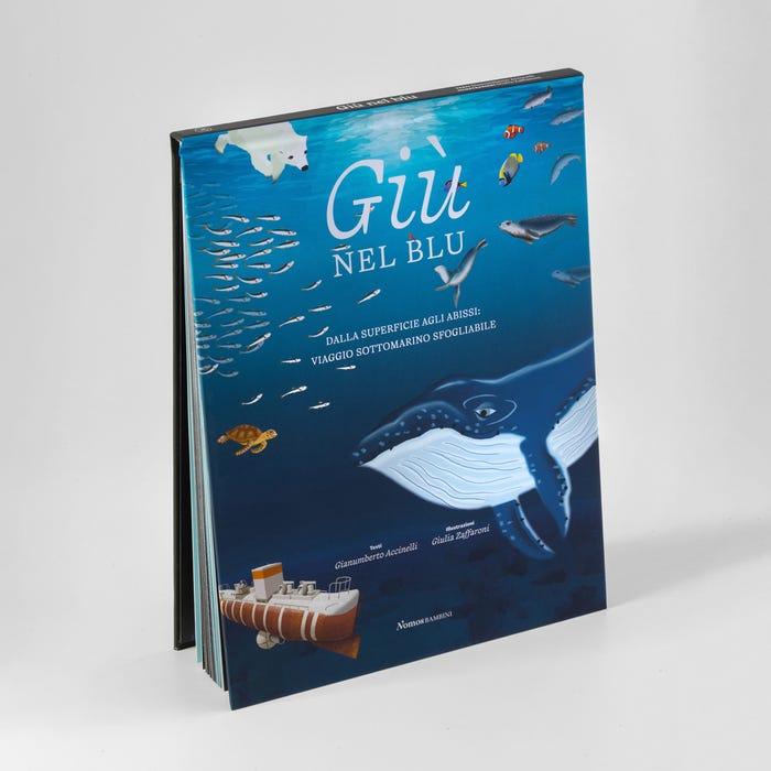
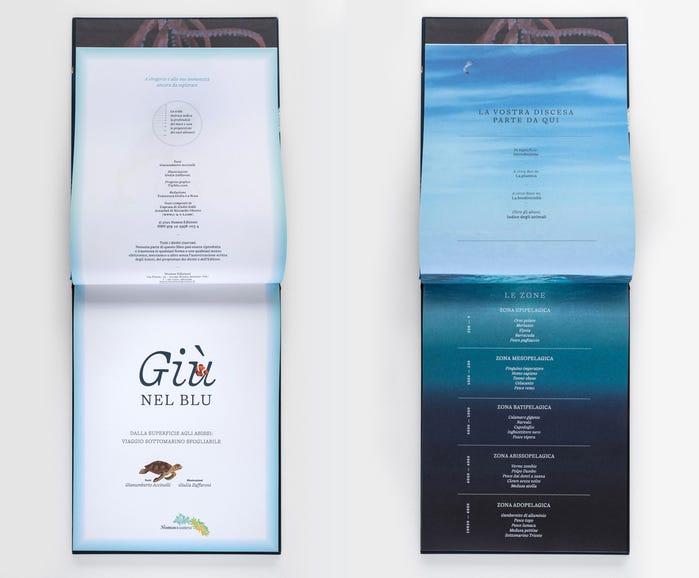
Another family with distinctive qualities is Capraia, drawn by Giulio Galli between 2018 and 2020, which will be the focus of this episode. Originally conceived for printed matter, Capraia features many details in its design that make it an exceptionally interesting typeface even at display sizes on digital media.
Starting with the “a” — one of the most recognisable letterforms in this typeface — through to uppercase letters such as “G”, “Q”, and “W”: Capraia knows how to be quirky in just the right measure, while remaining an elegant and highly legible typeface, thanks to its horizontal proportions and high x-height. In practice, it lends itself to covering multiple aspects of a single project, ranging from a body text set in Book to a masthead in Bold Italic.
In Capraia, as in the foundry’s broader research activities, what persists across every CAST project is the experience and care of the contemporary type design school in Italy. It is specifically this clear mission of cultural resistance that makes CAST the ideal archetype of an independent type foundry.