Loading journal
Baseline
EP. 07 – COLLLETTTIVO
Riccardo Merlotti
4 June 2026
After spending their university years together at the Politecnico di Milano, a group of six friends decided to turn their passion for type design into a joint project. In 2017, Collletttivo was born, built around a simple yet radical idea: design typefaces and make them freely available online. In other words, to become the first open-source type foundry in Italy.
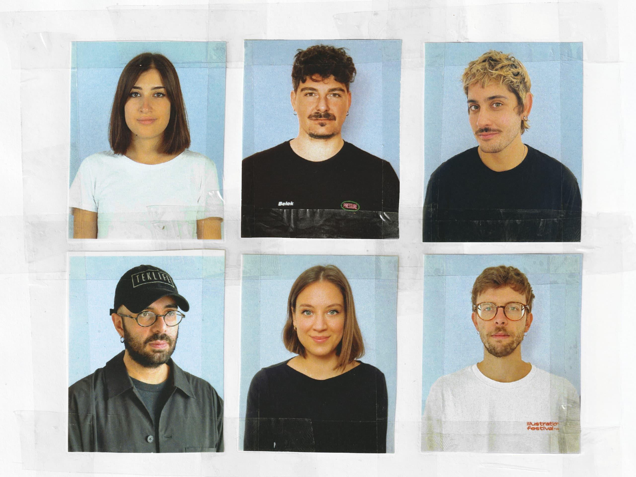
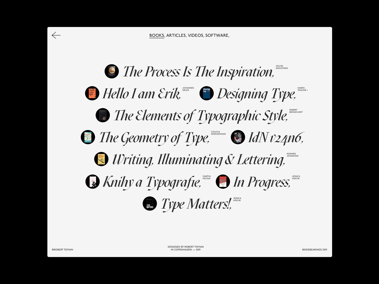
The double l and t in the name, whose meaning is libera tipografia (free typography), represent a leitmotiv that goes well beyond publishing typefaces for free. Over the years, Collletttivo has become a landmark in Italy (and not only in Italy) for emerging type designers, making materials and resources freely accessible to anyone approaching type design: from proof files to Glyphs lists, alongside reading suggestions.
“We were looking for feedback and dialogue on our projects, and discovered that it was precisely the community that could give us that: people asking for additional language support and testing our fonts in all sorts of contexts.”
This open and collaborative approach makes the foundry’s voice unique; it has always accompanied the fonts designed by its own members with those proposed by external type designers, to whom Collletttivo provides support and feedback without compromising their creative vision.
Thus, over the course of nine years, many notable typefaces from external collaborators have been added to Collletttivo’s catalogue: from Alberto Casagrande’s Mazius Display, a calligraphic serif with very clean lines; to a decorative typeface with a fantasy-inspired look such as Sinistre by Jules Durand, which draws its details from uncial, Gothic and other historical references.
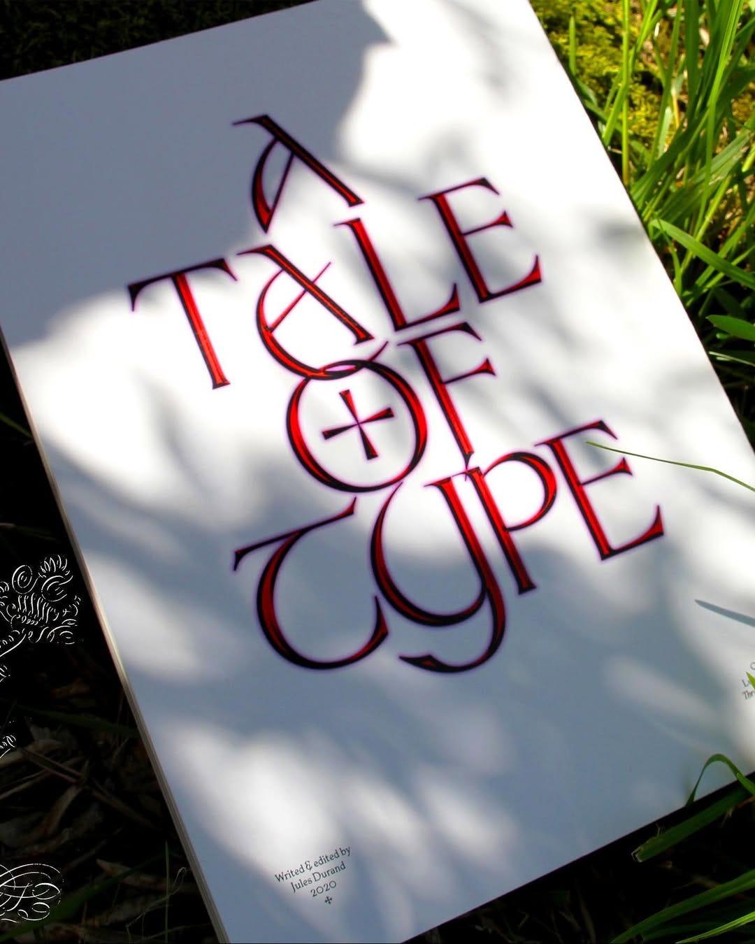
By releasing fonts under an open-source license, Collletttivo has seen its typefaces in use for a huge variety of projects over the years — such as, for example, the aforementioned Sinistre, used for the title track of the album Teatro d’ira - Vol. I by the band Måneskin. Among the most widely used typefaces are other major stars from the Collletttivo catalogue, such as Apfel Grotesk, Mattone and Ortica.
The first in particular, designed by Luigi Gorlero, is a geometric sans-serif with round shapes, which, together with the contrast in the darker weights, make it extremely playful as well as legible. What makes Apfel Grotesk even more unique is its Brukt version, eaten away like an apple within its forms to save ink in printing, created for the Milanese independent book fair SPRINT.
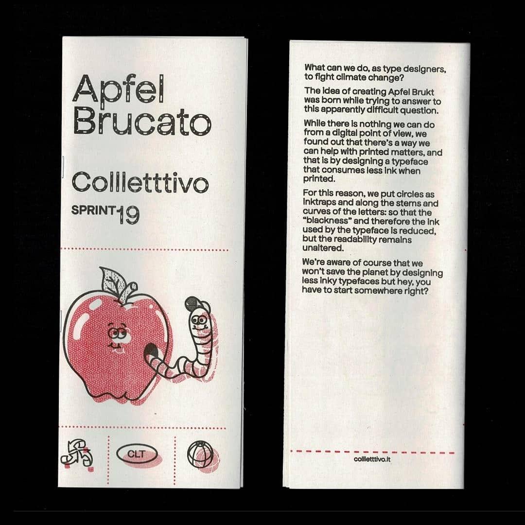
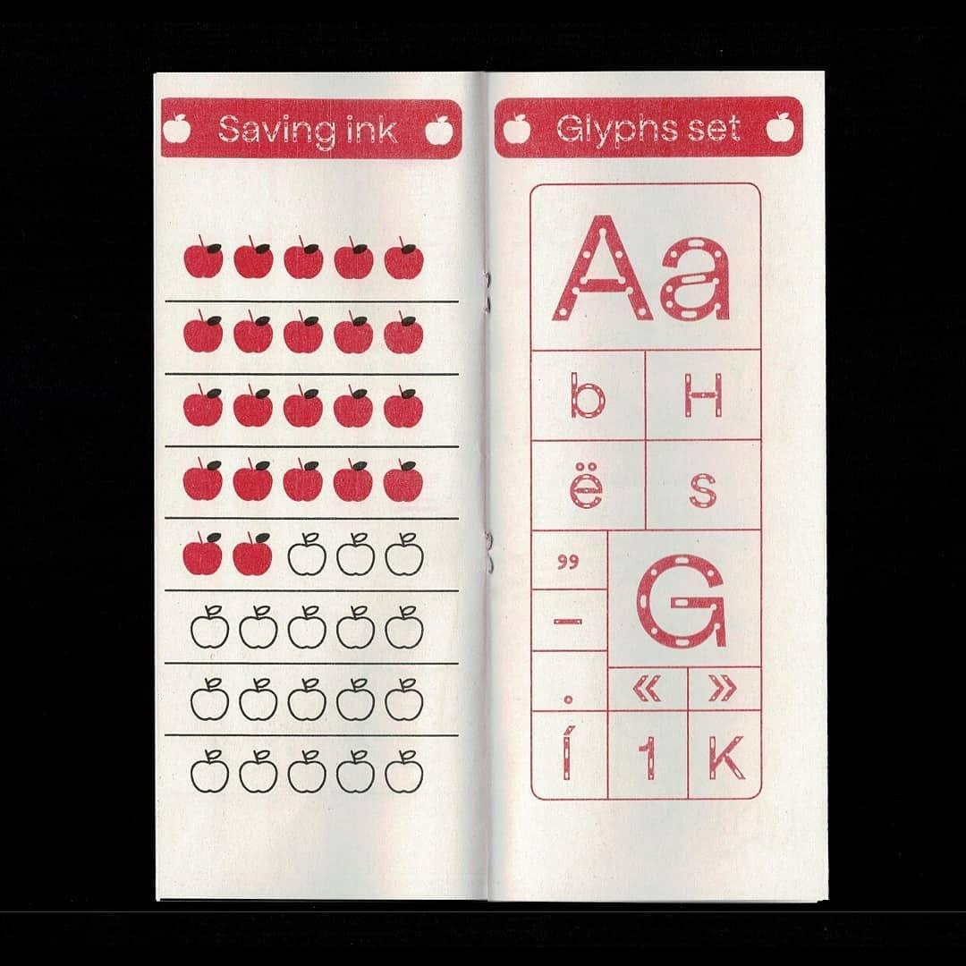
The focus of this episode, however, is not on one of the foundry’s already popular fonts, but on one of its latest releases: Ronzino. Designed by Nunzio Mazzaferro and Luigi Gorlero, Ronzino is probably one of the most successful Arial-inspired fonts and almost certainly its best open-source version.
Like other typefaces that have followed the footsteps of Monotype’s character, Ronzino has attempted to re-interpret some details in need of improvement, such as the tail of the Q, the very narrow J, and the dark junctions between the vertical stems and curves. The result is an Arial revival far more in line with the aesthetic standards of contemporary type design than the 1982 original, which remained unchanged to this day.
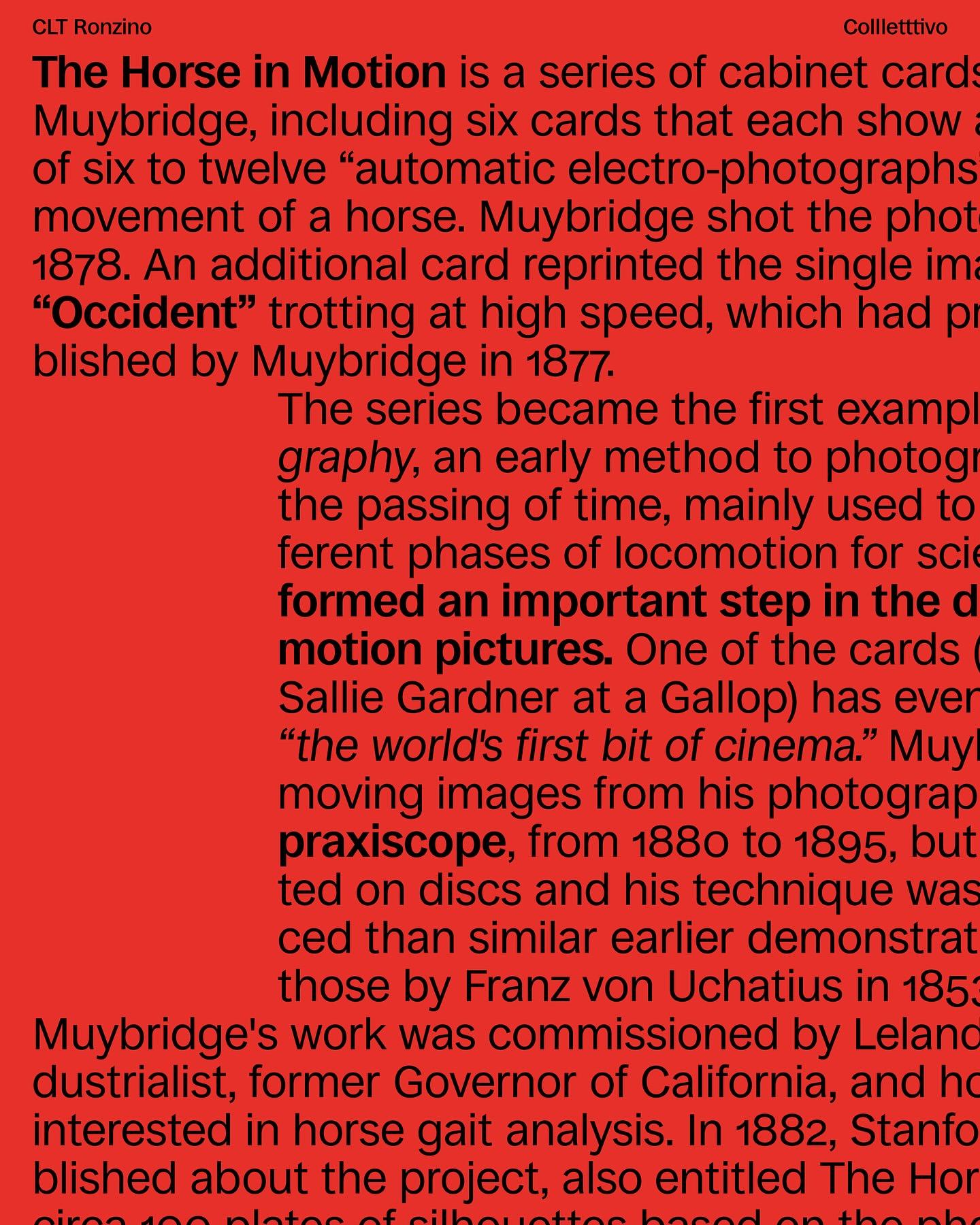
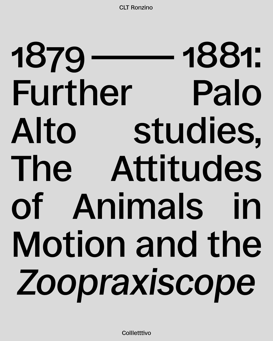
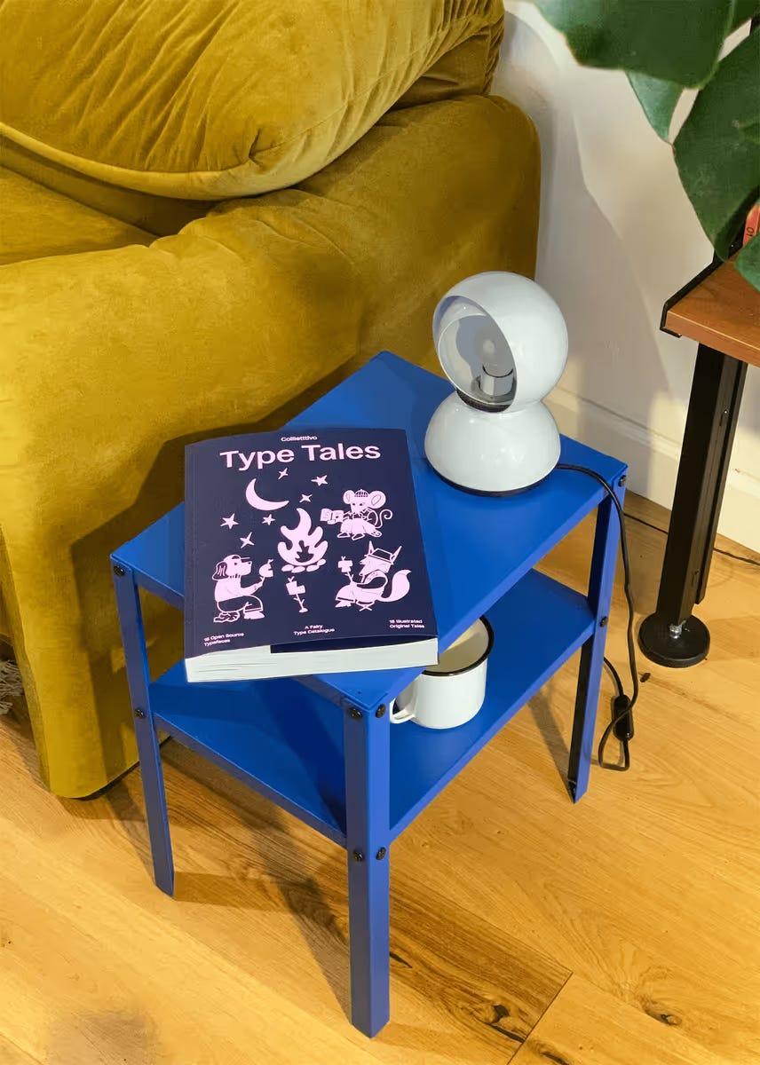
Using Ronzino just before the release — conceived from the outset to replace Arial as the foundry’s house typeface — Collletttivo published Type Tales at the end of 2024, the type foundry’s comprehensive specimen book showcasing the 15 typefaces released up to that point, alongside 15 fairy tales illustrated by members and external collaborators.
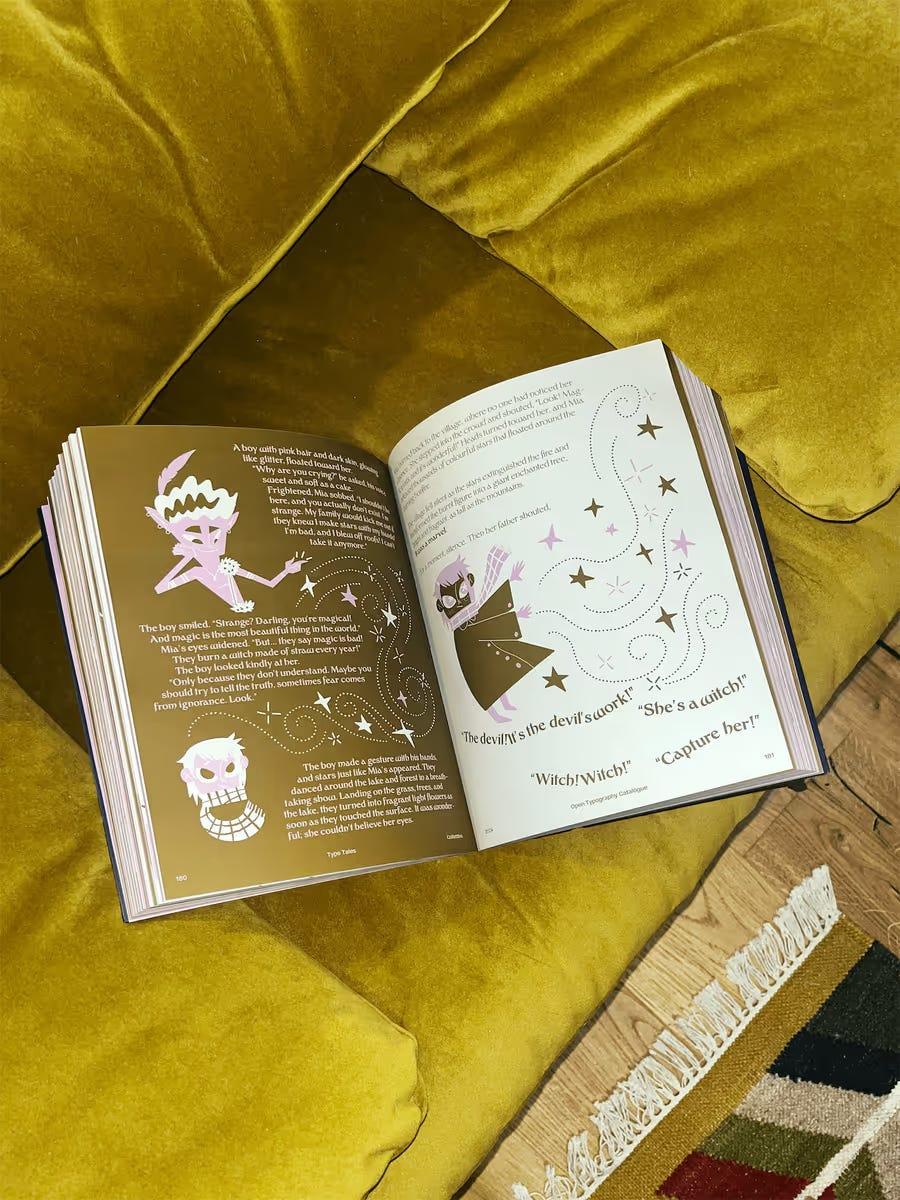
From 2017 to the present day, this welcoming tone, which aims to be entertained and entertaining, has remained a constant in Collletttivo’s style, making it, to all intents and purposes, the friendliest type foundry in Italy.