Loading journal
Articles
Neither Dog nor Wolf
Ludovica Polo
20 October 2026
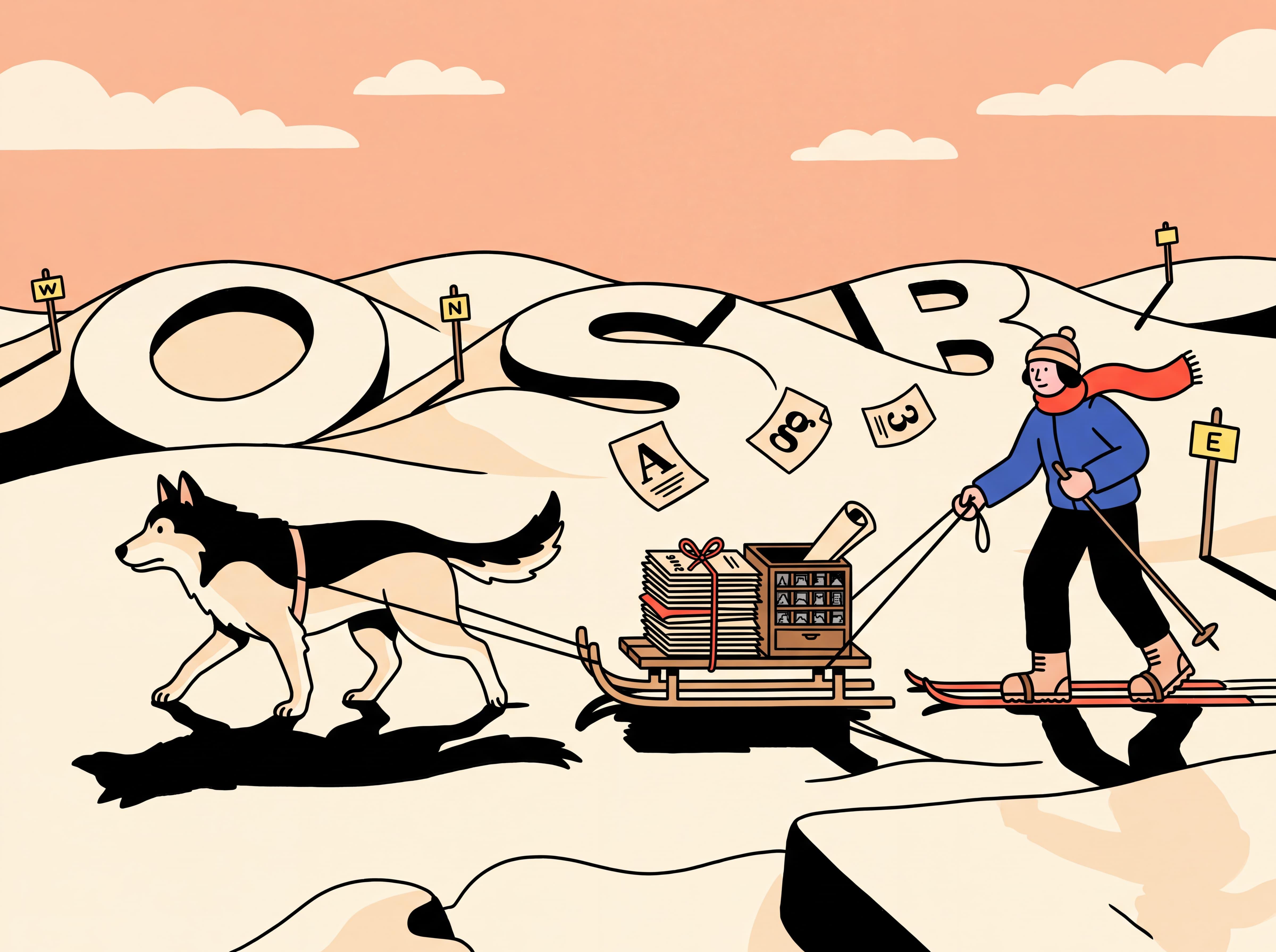
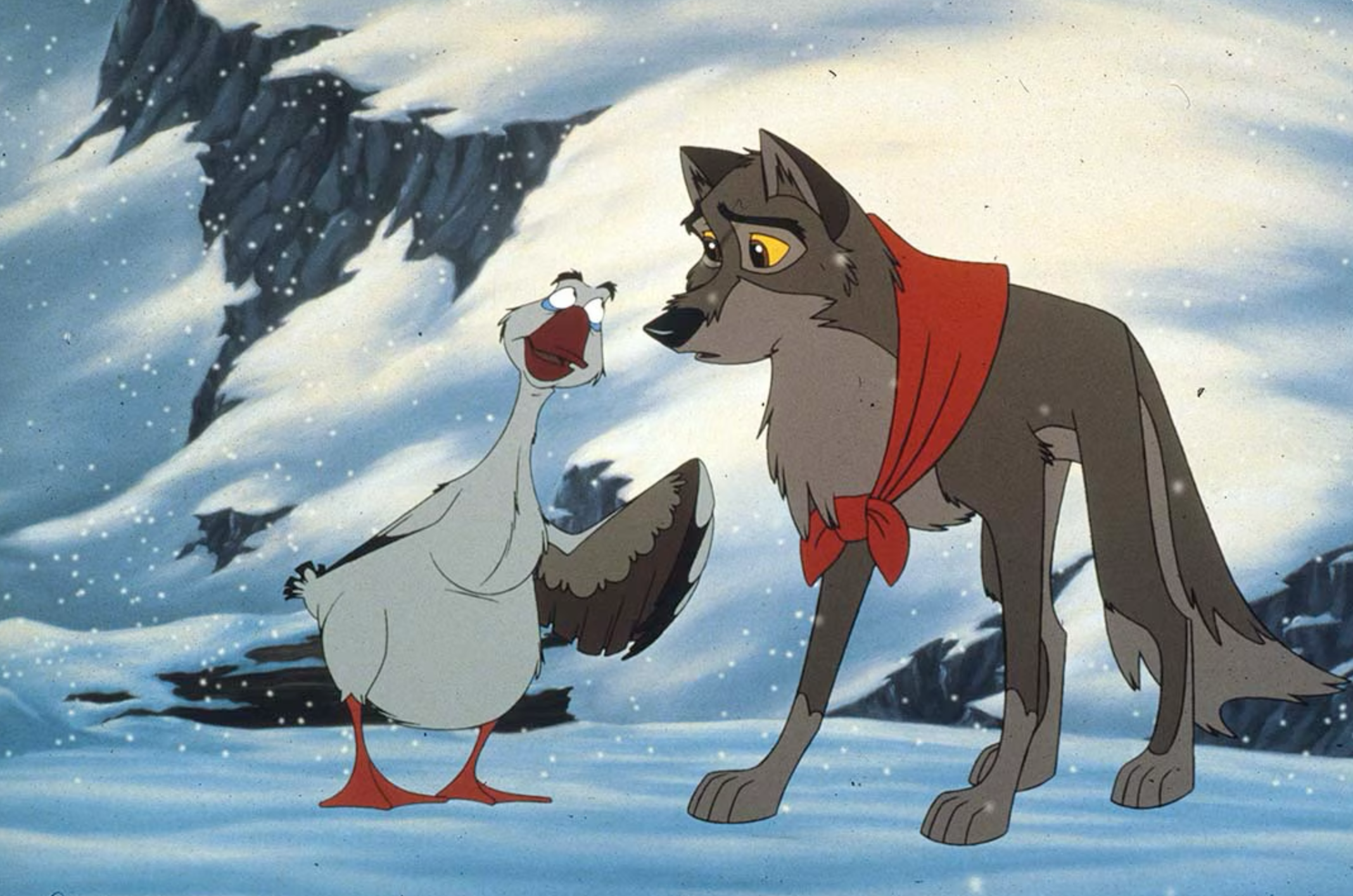
Do you remember Balto? The half-dog, half-wolf? In Italy, a PhD candidate is often perceived in more or less the same way: neither dog nor wolf; neither a "proper" researcher nor a student. So much so that I am often asked: "Ok, but what do you do as a real job?" (fig.1).
After at least a bachelor's degree, a master's degree, and perhaps a few professional and teaching experiences along the way, one may try to enter a PhD programme. Starting a PhD after studying design, and communication design in particular, is not the most obvious continuation of one's education. Yet, alongside different professional trajectories, it is one possible path. Narrowing the field even further, a PhD in communication design can take many forms: it may be tied to a specific funded research topic, developed in collaboration with companies or institutions, include a practice-based component, or move across a wide range of themes, often going beyond the "canonical" boundaries of the discipline and intersecting with other fields.
My own research is historical. It is situated at the intersection of typography and graphic design, and focuses on the promotional materials produced by type foundries as sources for reconstructing the circulation of typographic culture and graphic design practices between the 1950s and the 1970s. The aim of this short contribution is therefore to shed some light on what it means to conduct research in this field, through my personal experience.
When I applied for this particular doctoral scholarship at the Iuav University of Venice, I knew there would be certain constraints: that I would address a topic connected to typography – which was far from a limitation for me, since it is precisely one of my areas of interest; that I would work in partnership with an Italian institution, Tipoteca Italiana, which happens to lie some twenty minutes by car from my family home town; and that I would have to spend a minimum of six months abroad.
After setting aside many of my first ideas, I decided to start from the Tipoteca archive, at first simply exploring it and "letting myself be inspired". I soon realised that I did not want to focus on the physical typefaces nor on the printing machines, but rather on specimens, choosing the final period of metal type composition. At first I was captivated more by the period and its context than by the artefact itself. I was fascinated by the era that, from the mid-1950s onward, brought about a revolution within the printing industry over the following two decades: that of phototypesetting. It fascinated me because I had heard relatively little about it compared with the later shift to digital. But that is exactly what research is for. My first months saw me occupied, on the one hand, with a phase of desk research and literature review and, on the other, beginning to approach and grow familiar with a space that would shortly become my world: the archive.
Defining the topic and finding the method
For months I visited the Tipoteca archive regularly, combing through the trade journals, Graphicus and Linea Grafica first of all, but also numerous international magazines including Gebrauchsgraphik, Der Druckspiegel, Le courrier graphique and Graphis. I also gained access to many texts on the history and theory of the discipline, and I soon came up against the scarcity of specific literature to work with. I therefore began to build some of the tools I needed: a mapping of the European foundries active in the period of interest, and two databases in which to catalogue and describe, on one side, magazines and house organs and, on the other, the type specimens and catalogues. And it was at that moment – helped also by the requirement to spend one or more periods abroad – that I realised my research, which was taking ever clearer shape, would not be confined to the Italian context, opening up a question that troubled me for months: which contexts to consider? Which countries to include?
At this point I also understood that I would not concentrate on the artefact alone, but on the three phases in which it was involved: its design, how it was distributed across countries and, as far as the oral sources allowed, its use by printers and designers. After all, specimens too are “neither dog nor wolf” artefacts: graphic objects that speak about typography, commercial, educational and cultural tools at once, printed to be used for a limited period of time yet today, fortunately, preserved by some private collectors and by a few dedicated institutions – among them the Letterform Archive in San Francisco and the St Bride Library in London.
On the basis of the sources I was intercepting, I gradually defined my topic: the mediation of typography, within a frame that, as noted, did not limit itself to observing the Italian situation but set it in comparison with the European one. I came to understand that promotional ephemera and specimens allowed me to “read” a range of information concerning the production, mediation, and consumption of typography in the postwar period, and I complemented this information with a series of oral testimonies and correspondence.
Archival research between Italy, Spain and the Netherlands
My research develops mainly out of archival work and, over these two and a half years, I have engaged with a considerable number of institutions in Italy and abroad.
Starting with Italy: at the aforementioned Tipoteca I was able to discover – besides the library and the specimen archive – the Aldo Novarese fonds and, above all, the Giovanni Azzaro fonds. The latter, small but precious, was previously unstudied, so much so that I drew up its first inventory; through a dense web of correspondence in German (fig. 2), it allowed me to understand the relationship between a foundry – in this case Ludwig & Mayer – and its Italian distributor.
I then moved to Milan, where I examined materials from some fonds from AIAP's Centro di Documentazione sul Progetto Grafico (CDPG), beginning to reflect on the “impact” of the examples presented in specimens and on their reception by the designers of the time – an aspect that I later had to set aside, at least in part.
In the same period, besides visiting a few private collections, I travelled to Turin, where I consulted part of the Nebiolo fonds held at the Centro Storico Fiat (fig. 3); there, alongside the promotional materials, I came in contact with interesting internal documentation of the foundry. Archives, however, rarely hold everything they seem to promise and, unfortunately, there was a gap in the preservation of the documents relating to the period I was interested in: the material connected with the marketing and advertising department (Ufficio Pubblicità) dated exclusively from the late 1970s, from the moment Nebiolo had been acquired by FIAT.
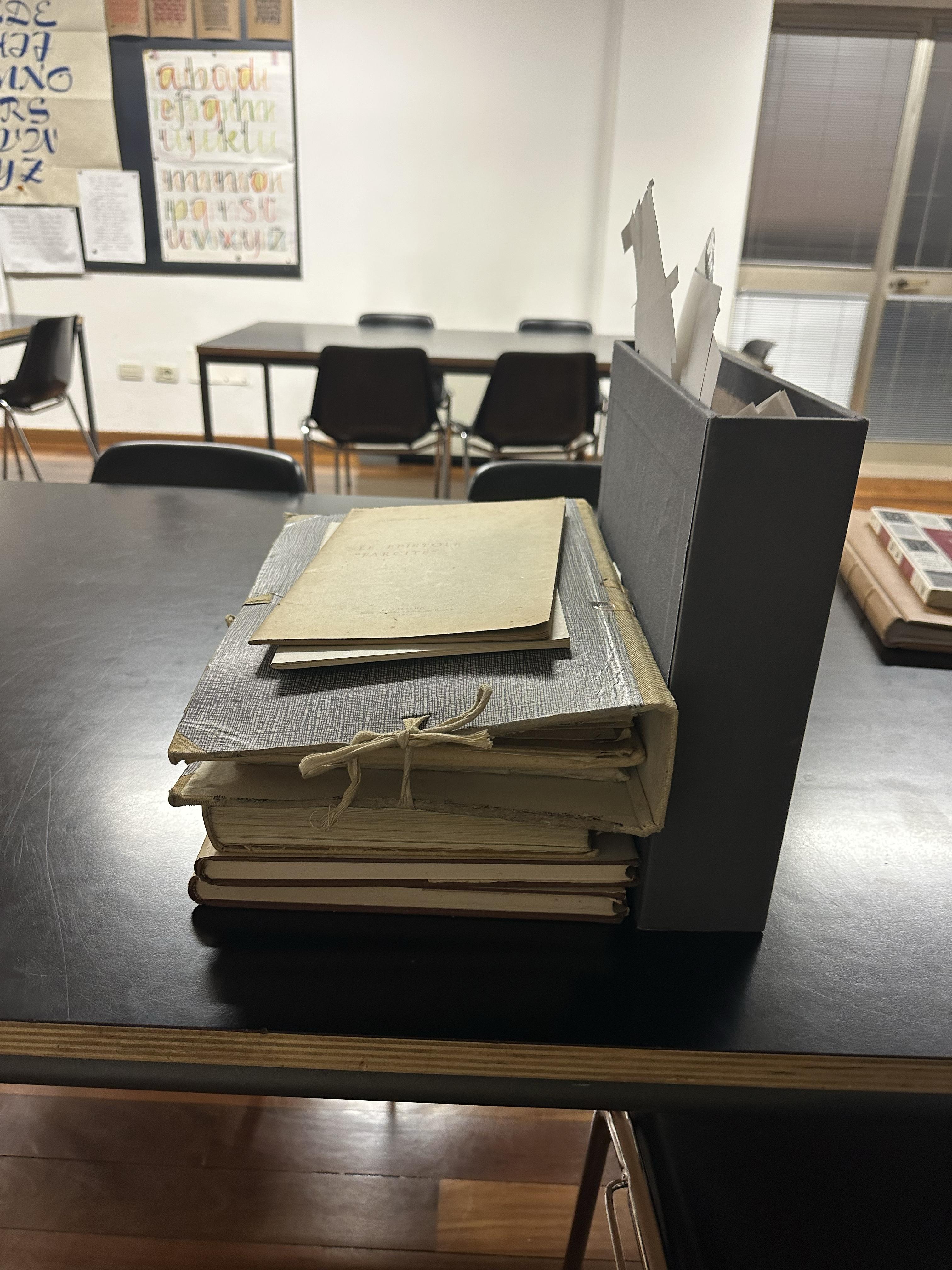
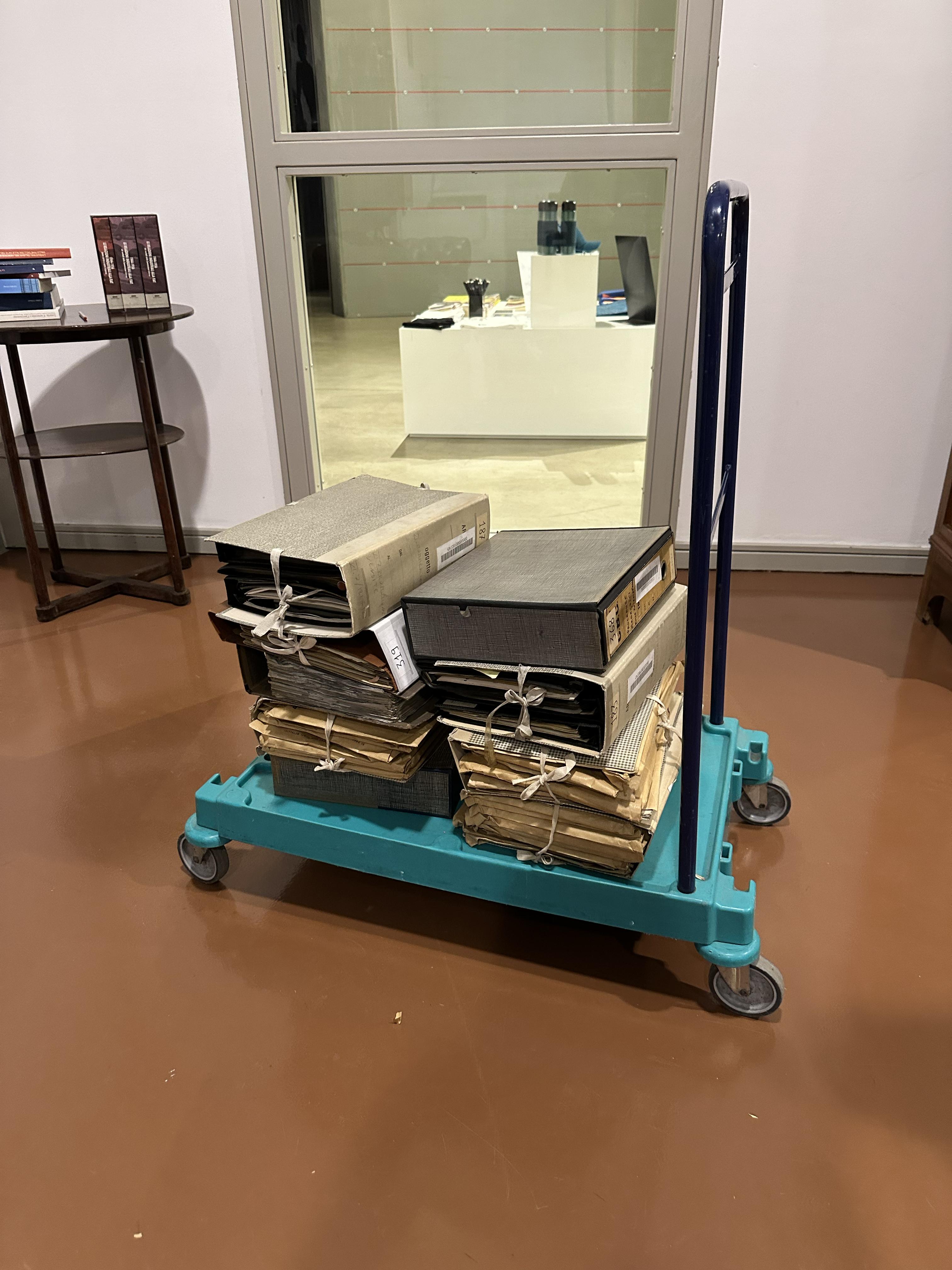
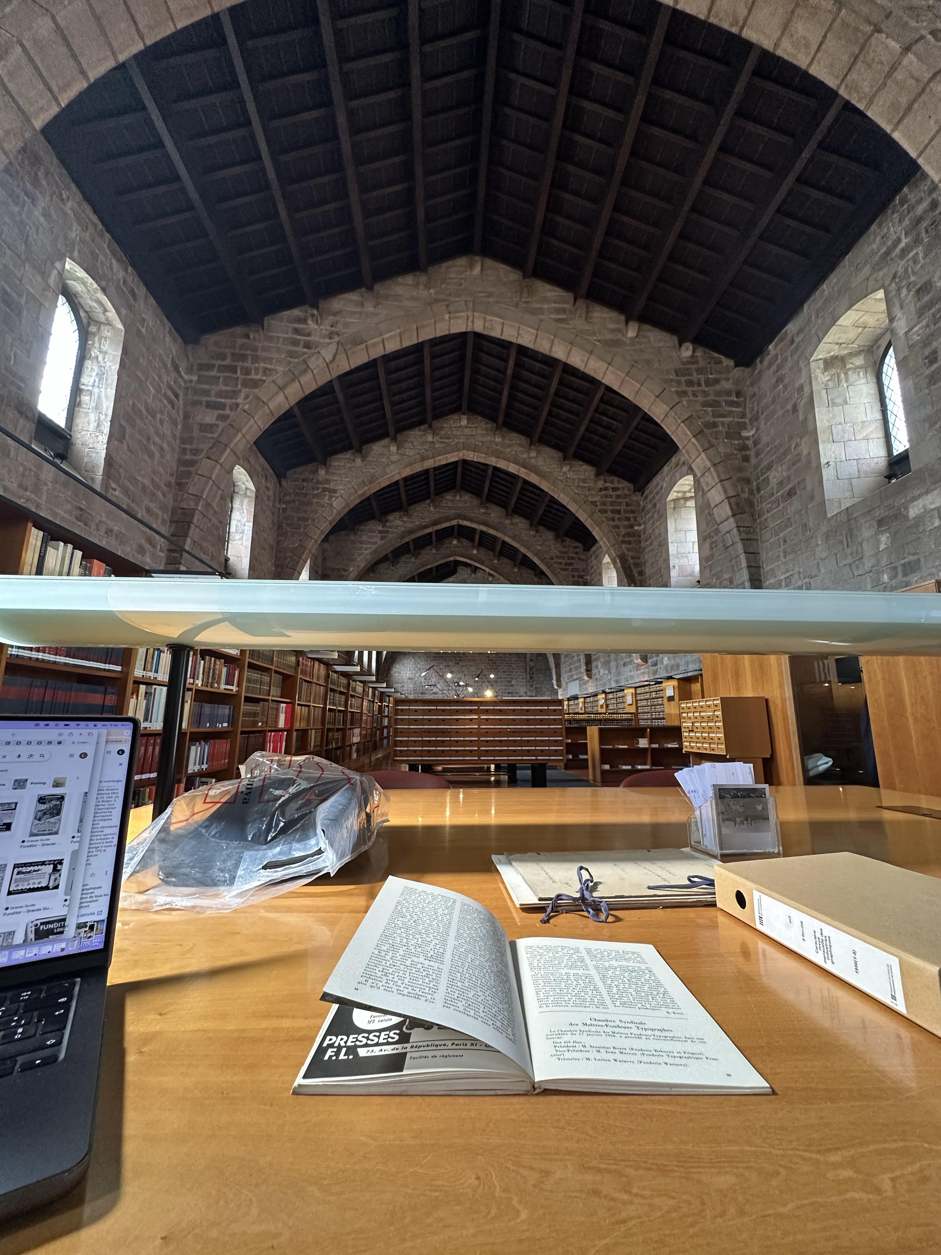
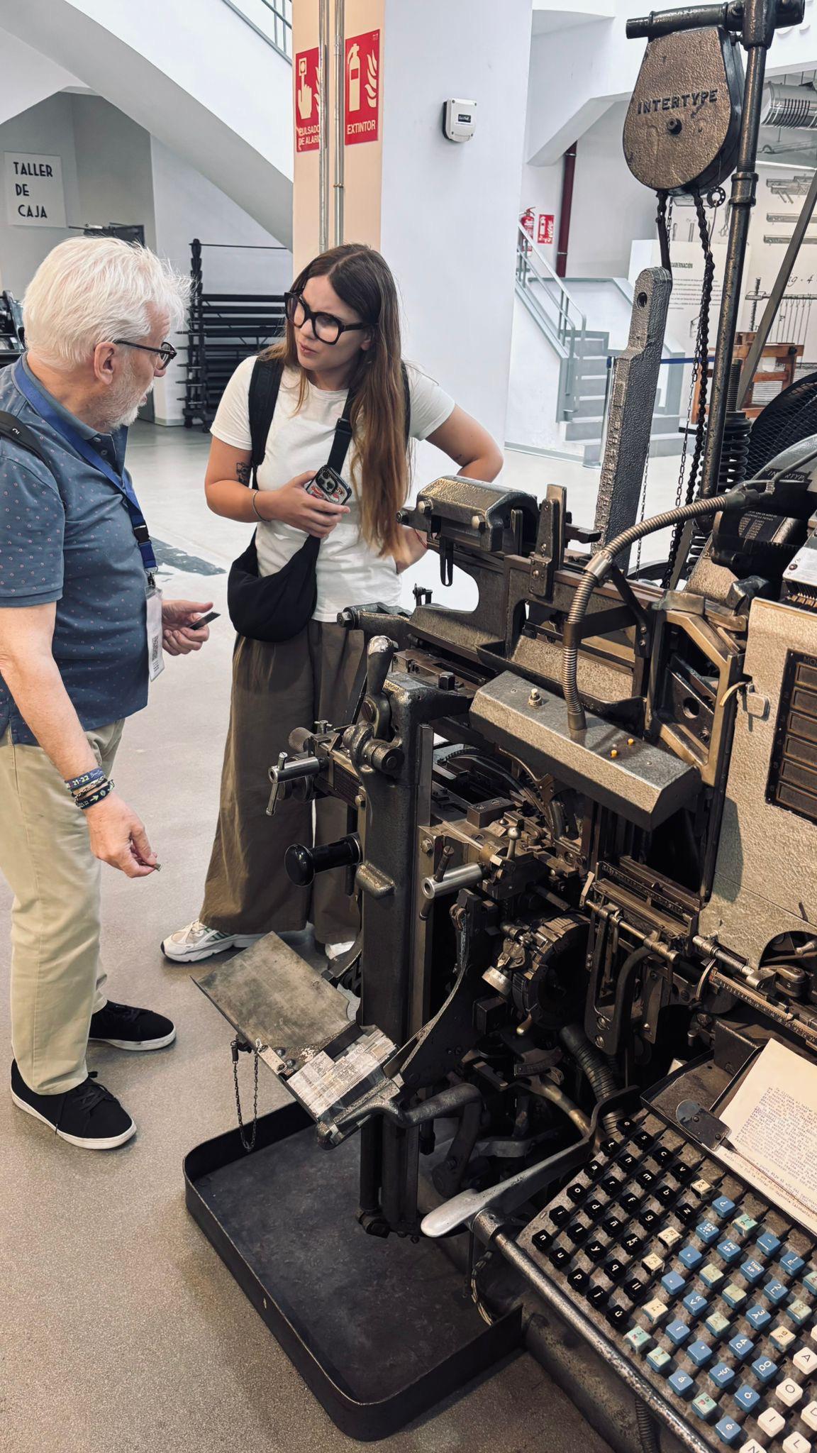
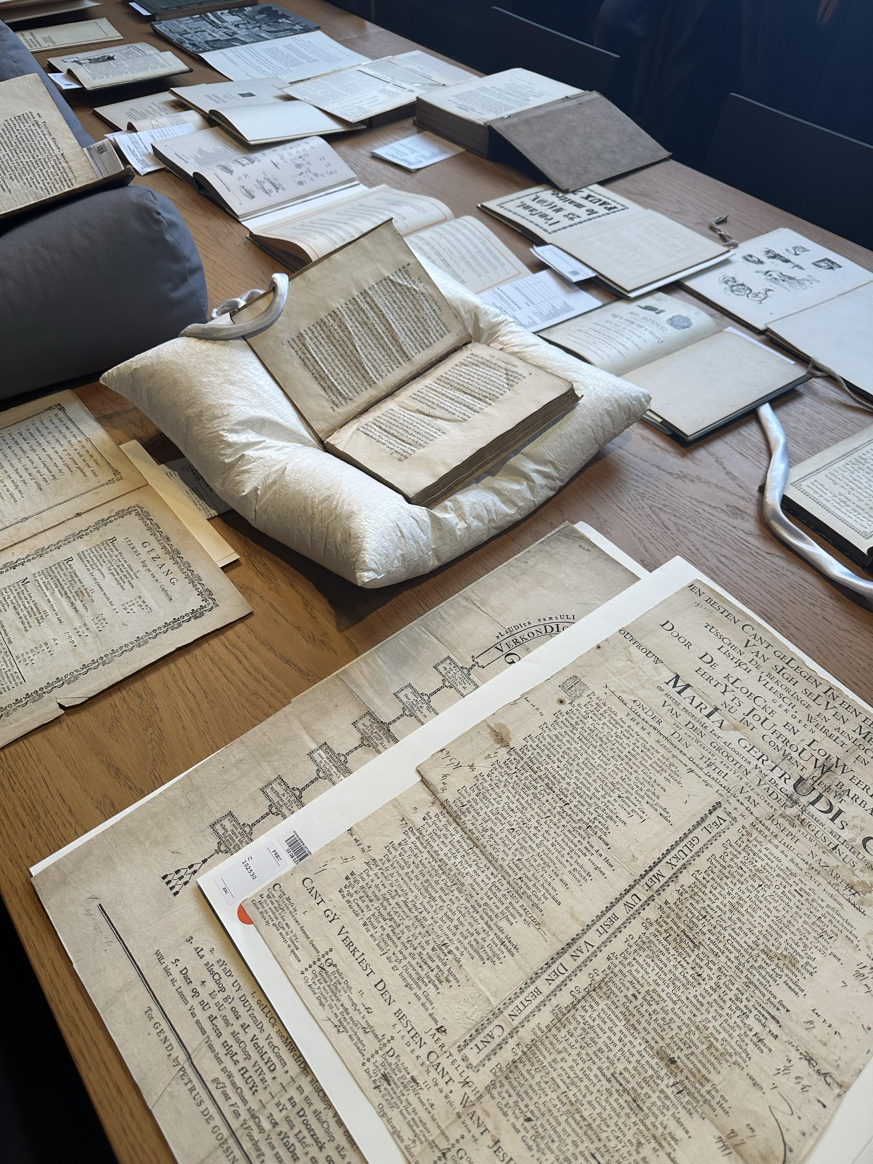
During 2025 I had the chance to spend several months in Barcelona, where I was a visiting PhD student at the Universitat de Barcelona, which holds an important typographic core: the Fons tipogràfic Bauer-Neufville. There I came into contact with a substantial corpus of German and Spanish materials, which I then complemented with many further consultations on Spanish soil: the Biblioteca de Catalunya, where, besides the Neufville house organs, I read many Spanish, French, and German trade journals (fig. 4); the Imprenta Municipal in Madrid (fig. 5) – where I was able to consult many specimens, magazines, and yearbooks, especially Spanish and French ones, among them the complete run of the journal Caractère Noël; and also the Disseny Hub, where gaining access to the huge underground archive was an extraordinary experience: walking among garments, carriages, and mirrors, I reached the area dedicated to printed ephemera and found a great number of materials I had previously selected from the inventory.
Alongside these successful visits, though, not everything went to plan. Some archives were closed, others out of reach, and a few did not hold the materials I had hoped for. To name just two: in Parma, the Centro Studi e Archivio della Comunicazione was closed for a few months, postponing my consultation of the Pino Tovaglia fonds; in Lyon, I never managed to reach the Musée de l'Imprimerie, closed for refurbishment until next year. Setbacks like these are part of research too.
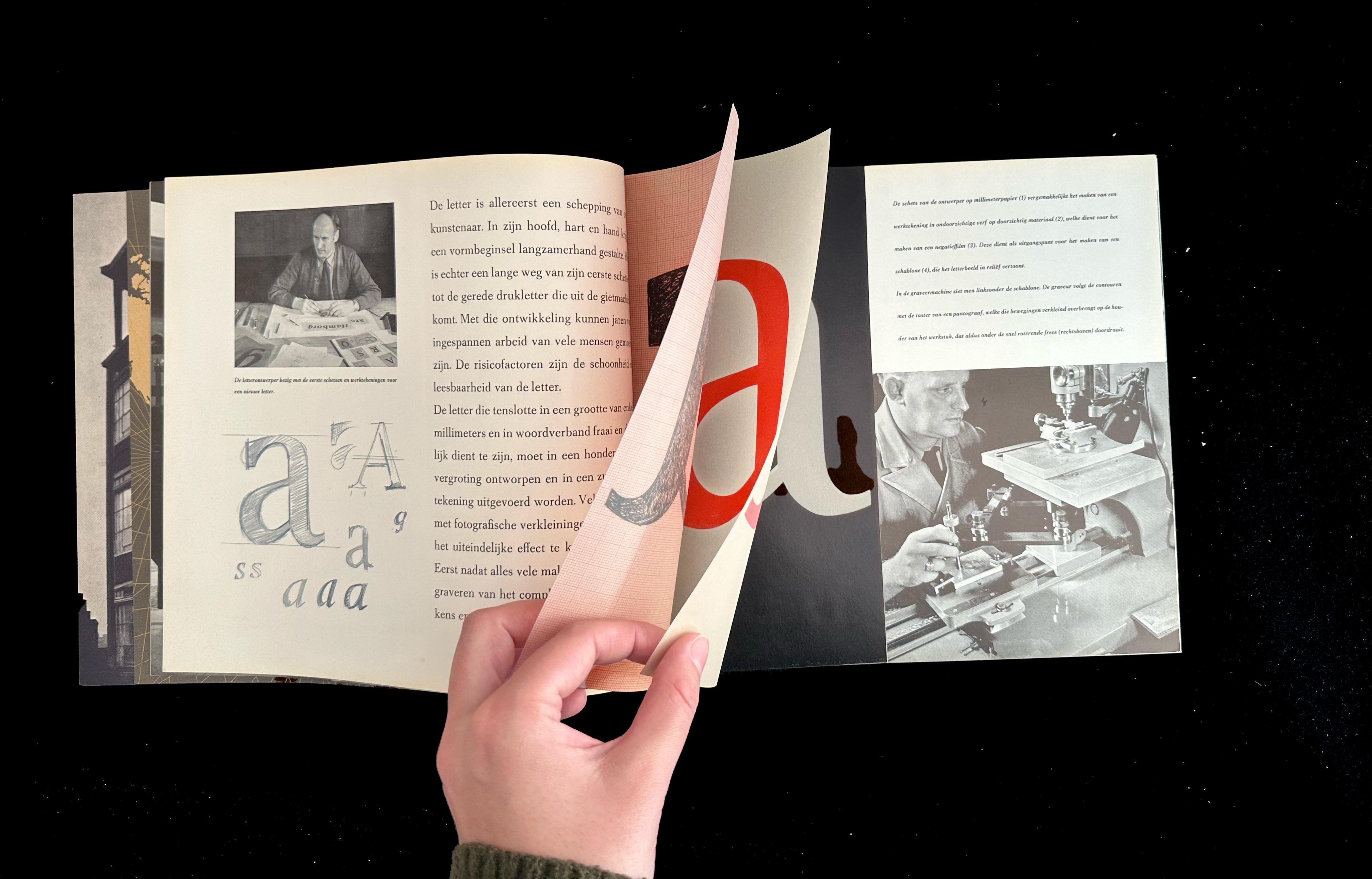
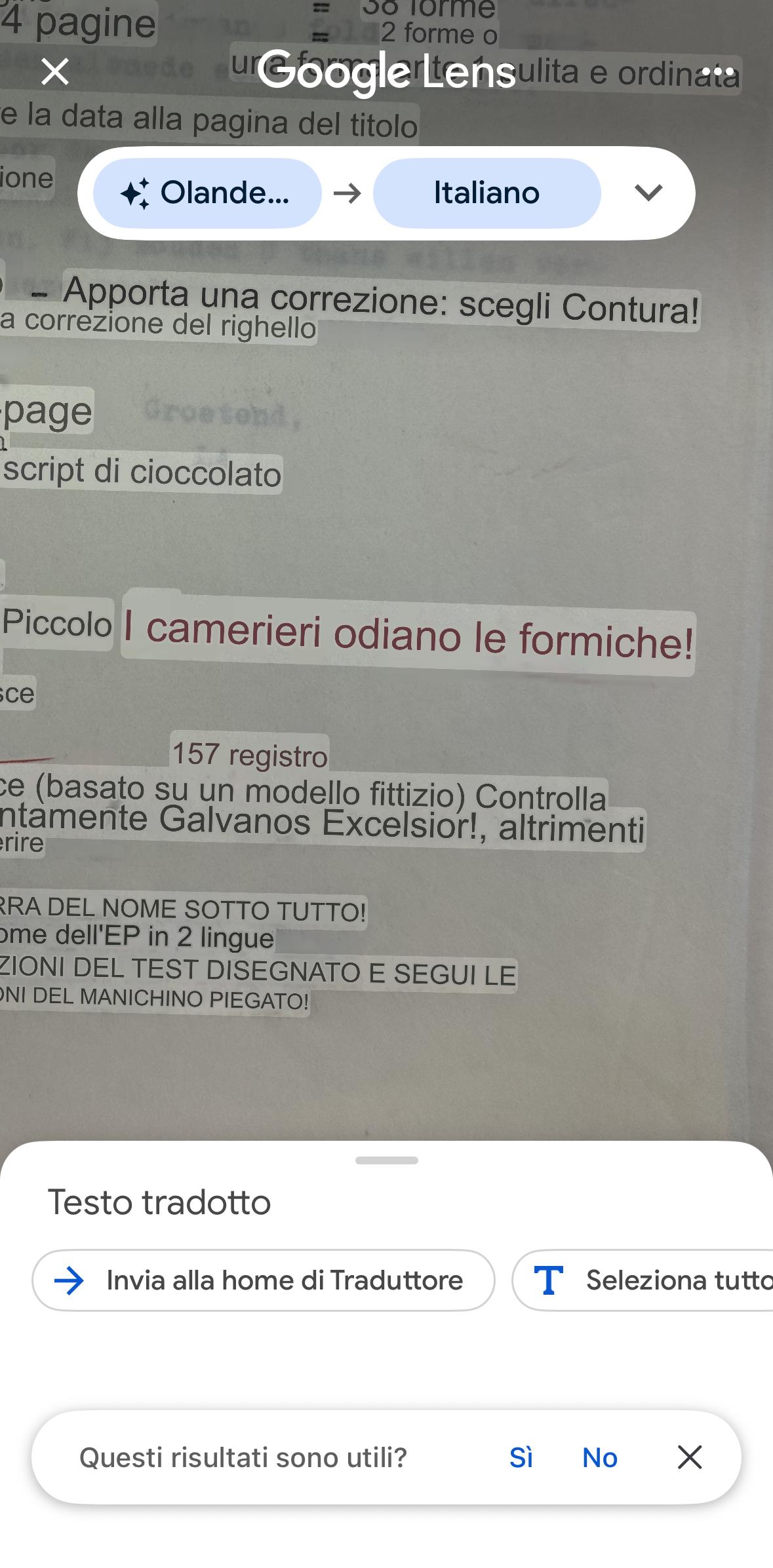
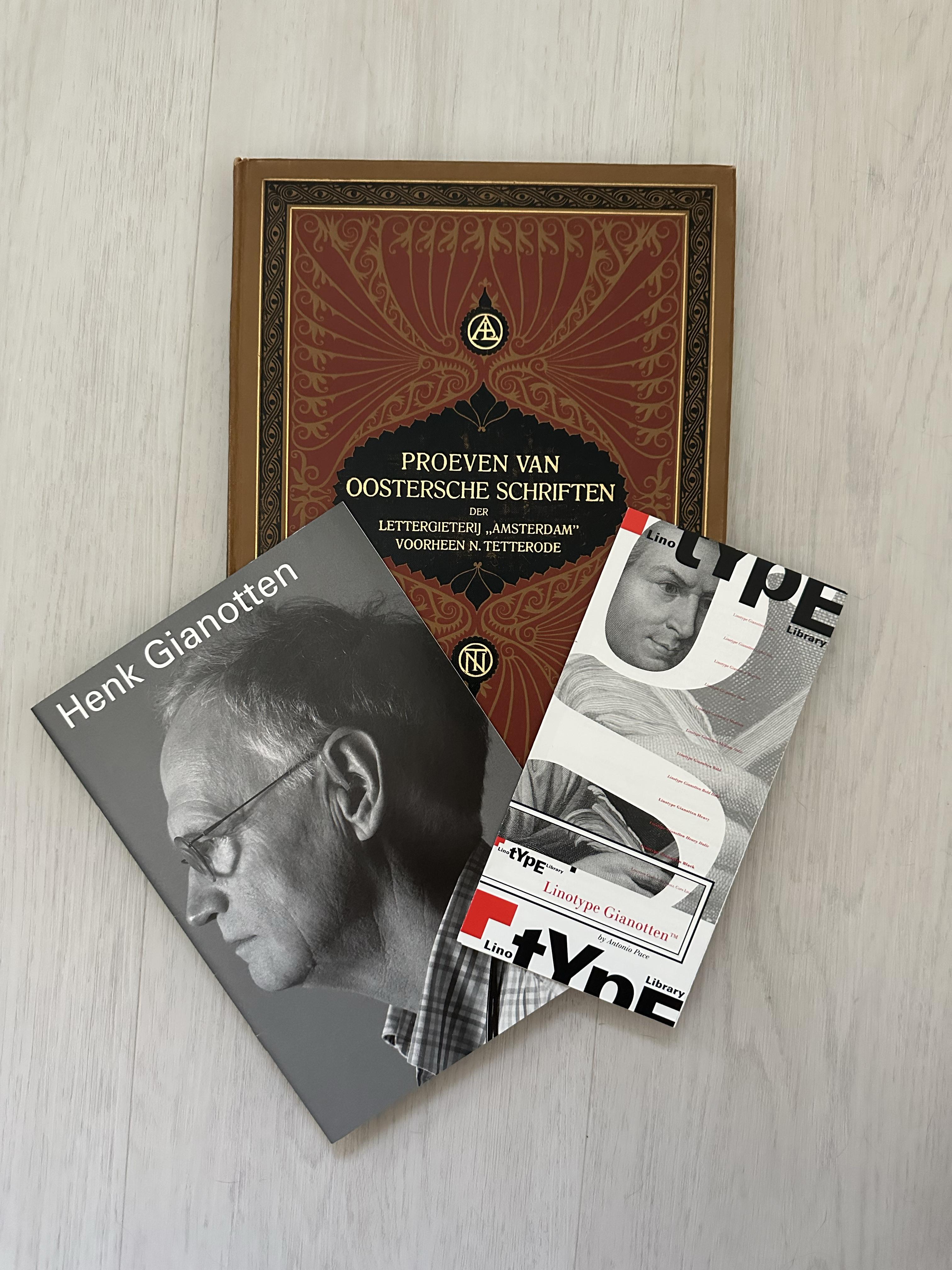
In spring 2026, however, I was able to spend a month in Amsterdam, where I studied the materials of the Lettergieterij Amsterdam (fig. 6), held at the Allard Pierson (Universiteit van Amsterdam). The remarkable history of this very extensive network of fonds – something quite rare where the archives of type foundries are concerned – included many international materials coming from the Typografische Bibliotheek that the foundry had assembled over the years starting from 1910. Along the way, correspondence in Dutch, German and French repeatedly tested my Google Translate, though it also gave me a few laughs (fig. 7). Here too I took the opportunity to explore other public and private collections in the Netherlands and Belgium (fig. 8), gaining access to precious materials and interviewing a key figure in the history of the Lettergieterij Amsterdam, Henk Gianotten, who experienced forty years of technological change in the printing industry at first hand, and who welcomed me into his home (fig. 9).
All the materials I have consulted and catalogued over these years have converged into an archivio in progress built in Notion. This prompted me to reflect on two questions in particular: first, how demanding it is to catalogue such heterogeneous artefacts – a challenge I also encountered in the widely varying ways institutions, archives and libraries preserve them today; second, I began to hypothesise a way of reading and analysing type specimens, in an attempt to find a comparable and replicable method for this kind of analysis and, consequently, for future research as well. I therefore started to move into a field that is certainly less familiar to me, that of AI, trying to understand how it might – starting from the materials I had collected, catalogued and annotated by hand – allow me to sketch outa platform dedicated specifically to type specimens.
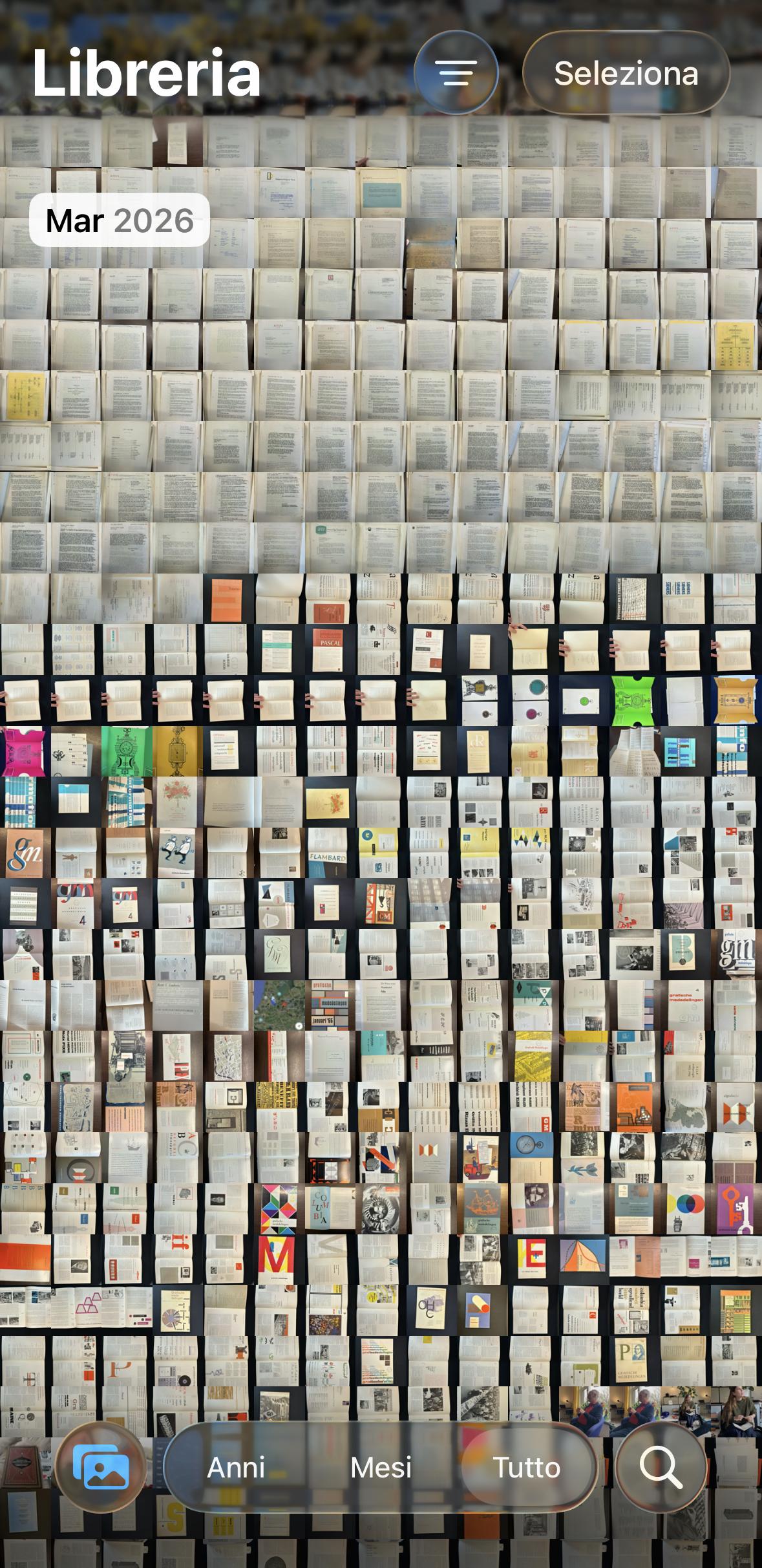
In general, my way of interacting with archival materials changed considerably over the course of the research, because my eye gradually became more "trained" to what I was looking for, and as a result I had – where geographically possible – to return to certain archives and look at the same materials again. The number of photographs, too, grew exponentially: whereas in my first visits I took only a few photos – those I thought necessary – over time I understood that it is always better to take a few more, because often, searching by keyword with OCR, I happen to find information I did not know I had but had in fact been looking for. The same thing happened in the archive itself: I often ended up looking for something entirely different from what I had intended, partly because of how easily I get distracted, partly because of my enthusiasm for these subjects and for the intersections between disciplines, technologies and cultures that every so often emerge from artefacts considered "minor". Sometimes, especially when scrolling through my iPhone's gallery, I think I have overdone it (fig. 10); I think that definitely not everything I have researched and found over these years will make it into my thesis – now in the writing phase – but I also think that this research has given me the chance to come into contact with a great many people: collectors, designers, academics and typographers.
To return to Balto, this feeling of being “in between” is something I also recognise in the memes that, rather accurately, seem to narrate my research life: memes about archives and archival work (https://www.instagram.com/p/DXrHi4Bn72I/ ), memes about being a PhD student (https://www.instagram.com/p/DTLcnAgiGyT/) and also memes about graphic design (https://www.instagram.com/p/DSIGfFljb7o/ ). Somehow, the combination feels precise. It reflects a position that is not entirely one thing or the other, but is built through the constant crossing of different practices and communities.
Despite all this time spent on a single subject and all the materials gathered, every now and then I think about the paths I was not able to take, and about the limits – of time and funding, among other things – to which academic research must answer. I may still have no good answer to the question about my “real job”. What I have is one database for type specimens and another for trade journals, 67,264 photographs on my iPhone – at least a quarter of which are related to this research – a mapping and an inventory that did not exist before, and a fairly precise idea of how type foundries promoted and communicated their typefaces in the second half of the last century.